
Dermocosmetics · Exelderma
X-Trias Combination Triple
A branding, packaging and communication MVP designed to validate the market positioning of a triple-action anti-stretch mark cream before broader commercial rollout.
A branding, packaging and communication MVP designed to validate the market positioning of a triple-action anti-stretch mark cream before broader commercial rollout.
X-Trias was created to validate how a new anti-stretch mark cream could enter the dermocosmetics market with a distinctive, credible and scalable identity before wider commercial investment.
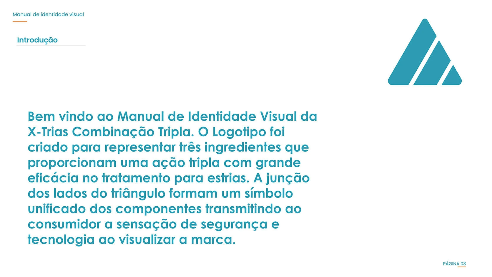
The concept translated the formula’s three principal components, Growth Factor Complex, vitamin C and hyaluronic acid, into a unified triangular symbol. Rather than presenting the ingredients as disconnected claims, the identity communicates their combined action through one recognisable visual structure.
The first functional brand system included the essential assets required for launch preparation and market testing: visual identity, a complete brand guideline, product label, packaging mockups and initial campaign materials. The project deliberately focused on branding and communication; website development was not part of this scope.
A practical first version of the brand created for validation, presentation and commercial testing.
Three active pillars were transformed into one clear and memorable brand promise.
The identity needed to support packaging, campaigns and future communication while remaining flexible enough to evolve.
My role covered the strategic and visual translation of the product proposition into a complete identity system. The work connected the naming treatment, symbol, colour language, typography, packaging hierarchy and communication applications so the product could be evaluated as a credible market-ready concept.
Converted the product’s three-component formula into a visual proposition centred on combined action, technology and skin care.
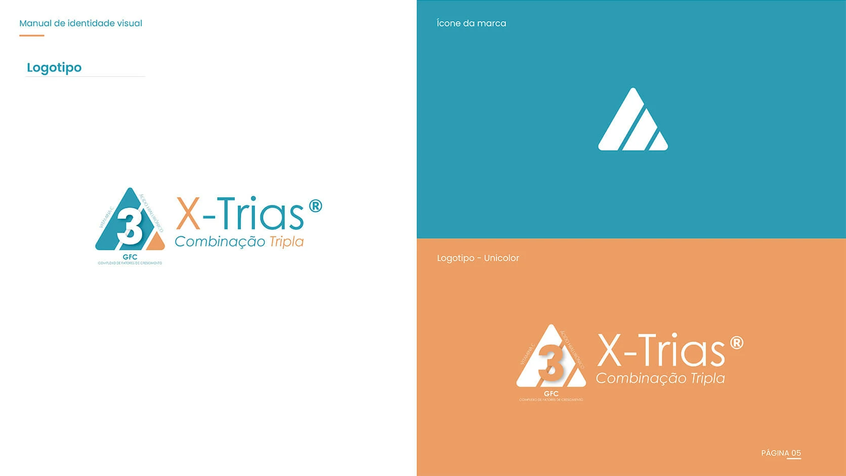
Developed the primary logo, symbol logic, colour system, typography and rules required for consistent reproduction.
Applied the approved identity to high-fidelity packaging mockups so the physical presentation could be reviewed before production.
Created the initial visual language for campaign materials, demonstrating how the identity could extend beyond the package.
The visual proposition was built around the formula’s three core elements: Growth Factor Complex, vitamin C and hyaluronic acid. Each ingredient contributes a different function, but the product promise depends on their combined action. The identity therefore needed to communicate unity rather than three separate messages.
The triangle became the central form because it naturally supports the idea of three connected components and a stable, unified solution.
The number three reinforces the product proposition immediately, making the triple combination visible even before the supporting copy is read.
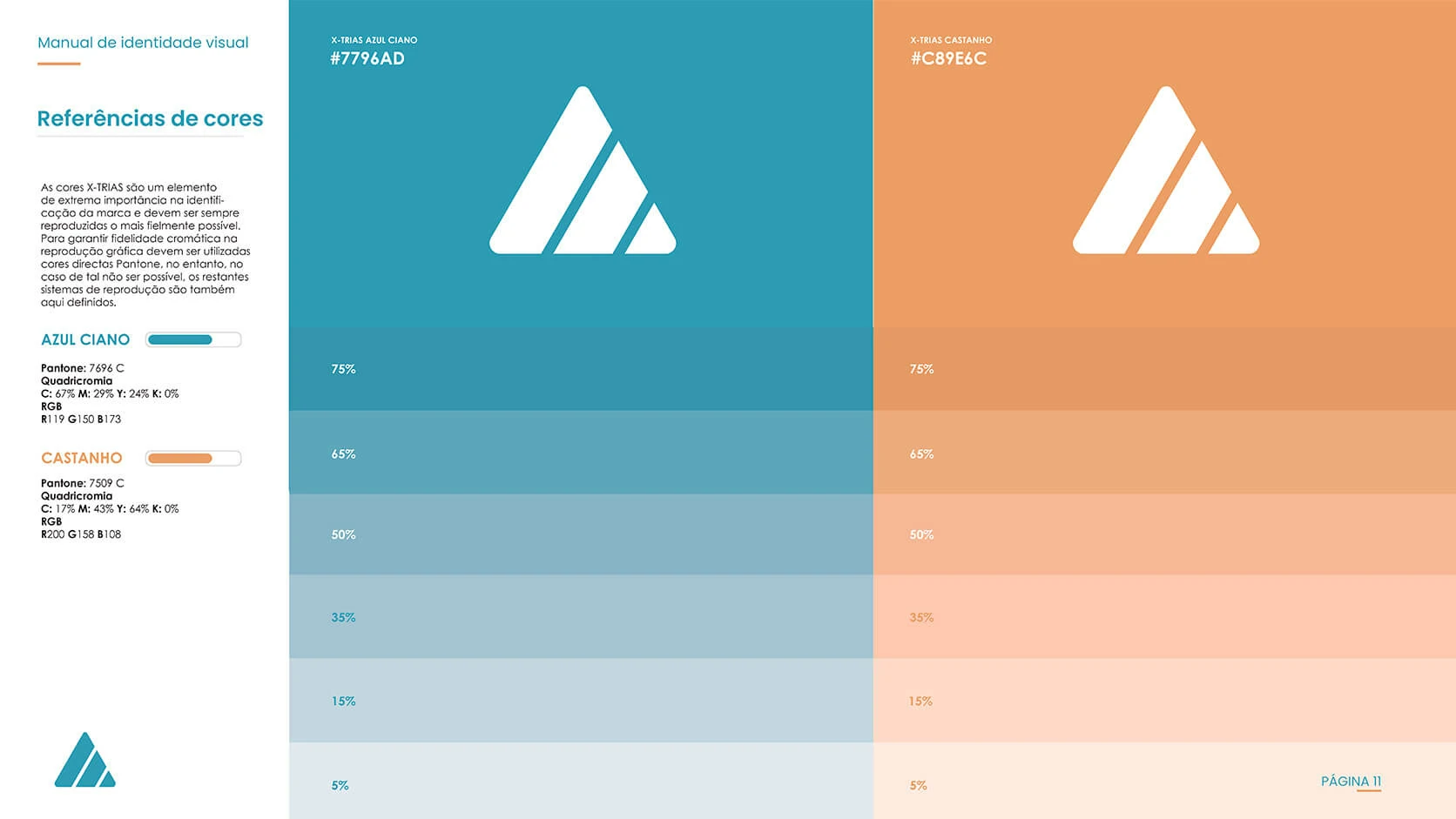
Cyan blue communicates technology and dermocosmetic credibility, while orange adds warmth, energy and distinction.
The symbol and verbal structure were designed to remain useful across packaging, educational materials and future campaign formats.
Three complementary components work together as one treatment proposition, a relationship expressed through the geometry, the number three and the “Combination Triple” descriptor.
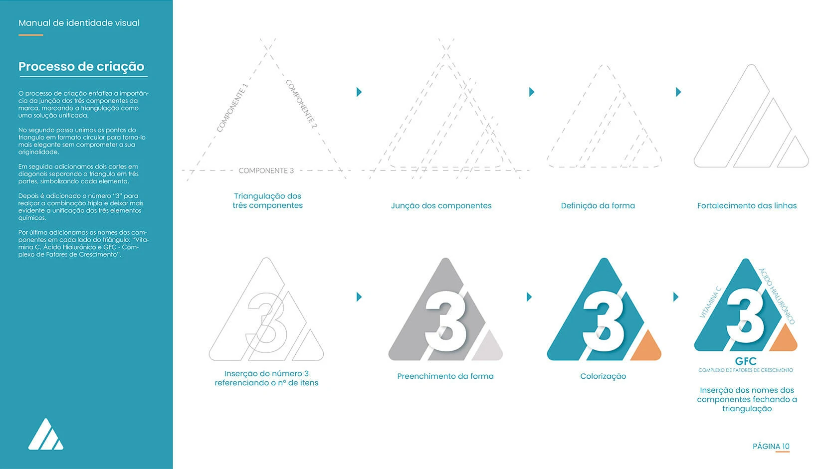
The symbol construction began with three triangular elements. Their alignment, overlap and separation created a unified silhouette that could represent both the formula’s composition and the sense of a technologically structured treatment.
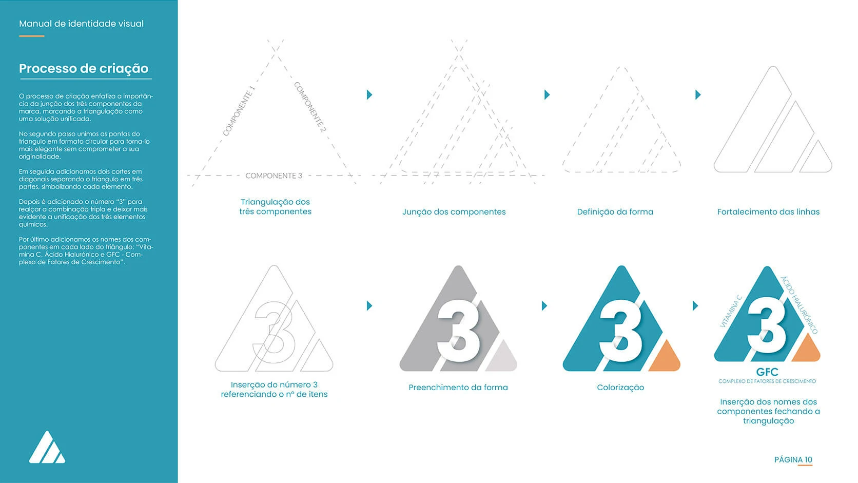
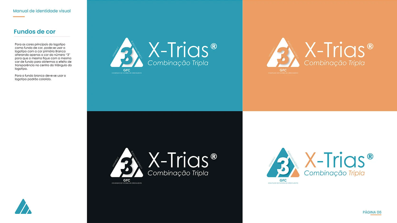
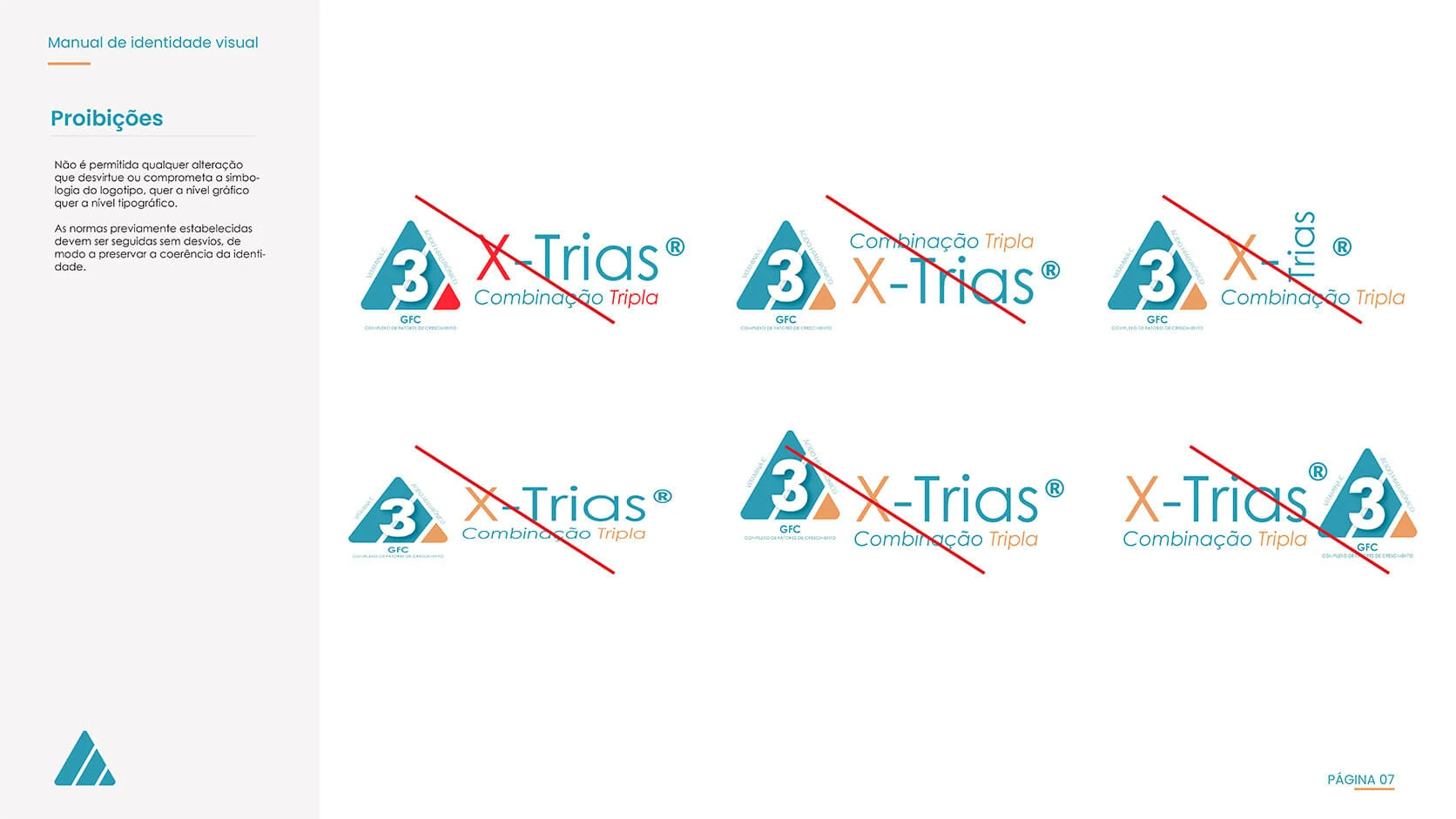
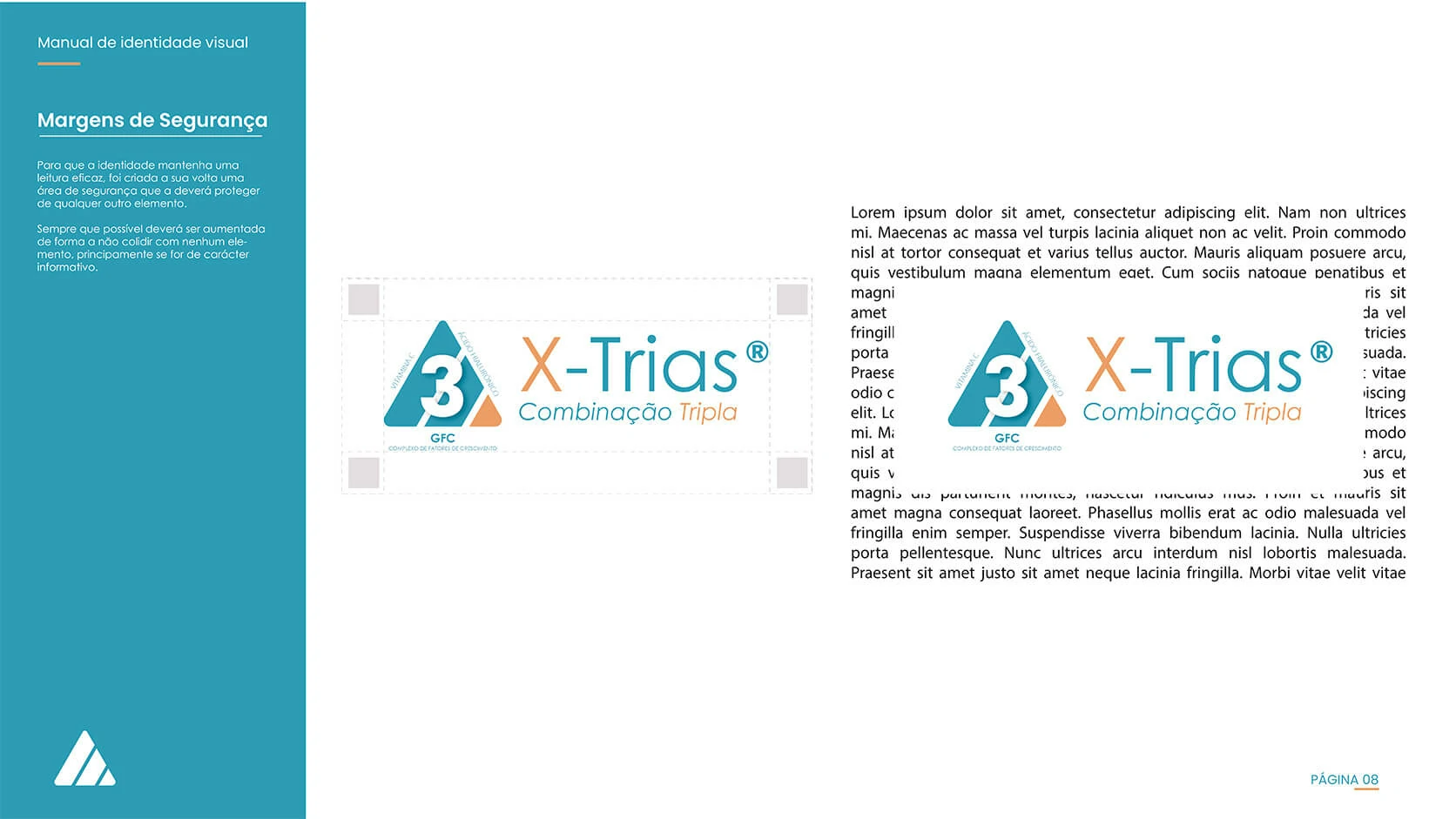
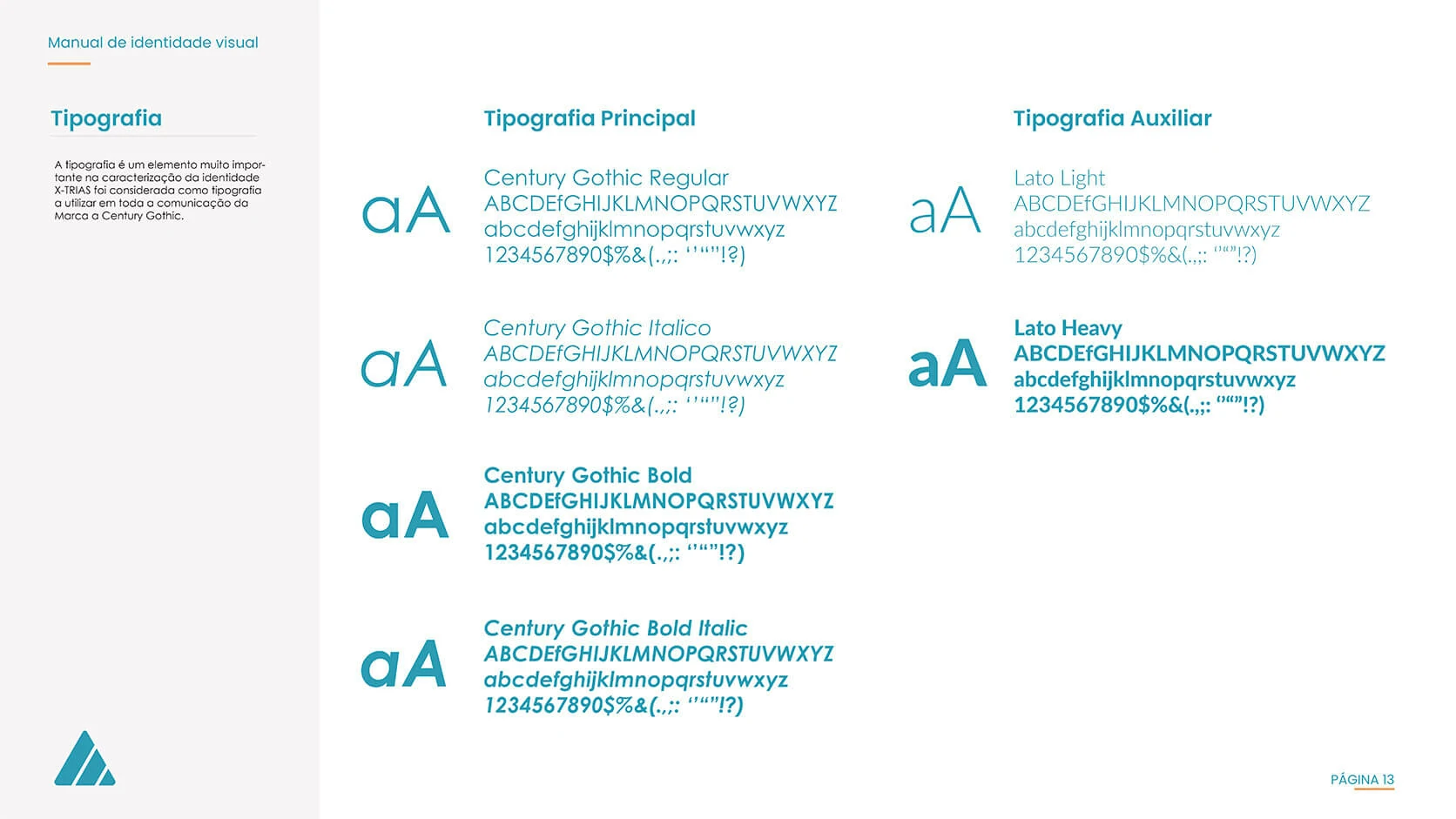
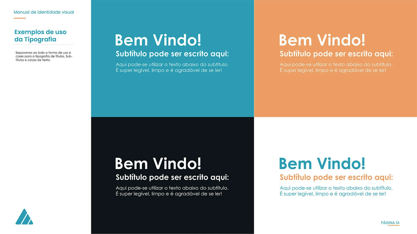
The identity was documented beyond the primary logo. Colour behaviour, monochrome applications, safe margins, incorrect uses, image backgrounds and typography were defined so future materials could be produced without weakening recognition or visual consistency.
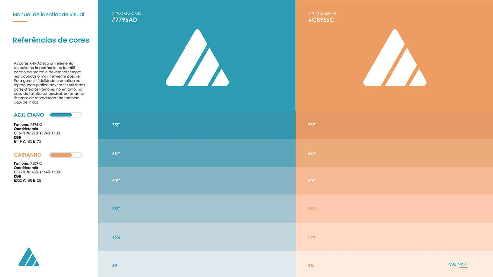
Supports a modern, technical and dermocosmetic perception while maintaining a clean visual presence.
Adds energy and creates contrast for the “X” and triple-action message.
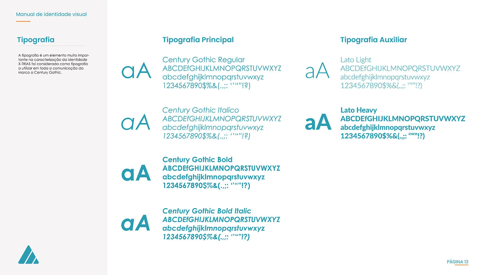
A geometric primary family and a readable supporting family provide flexibility across brand and informational content.
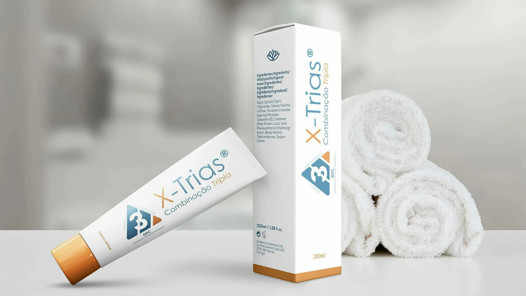
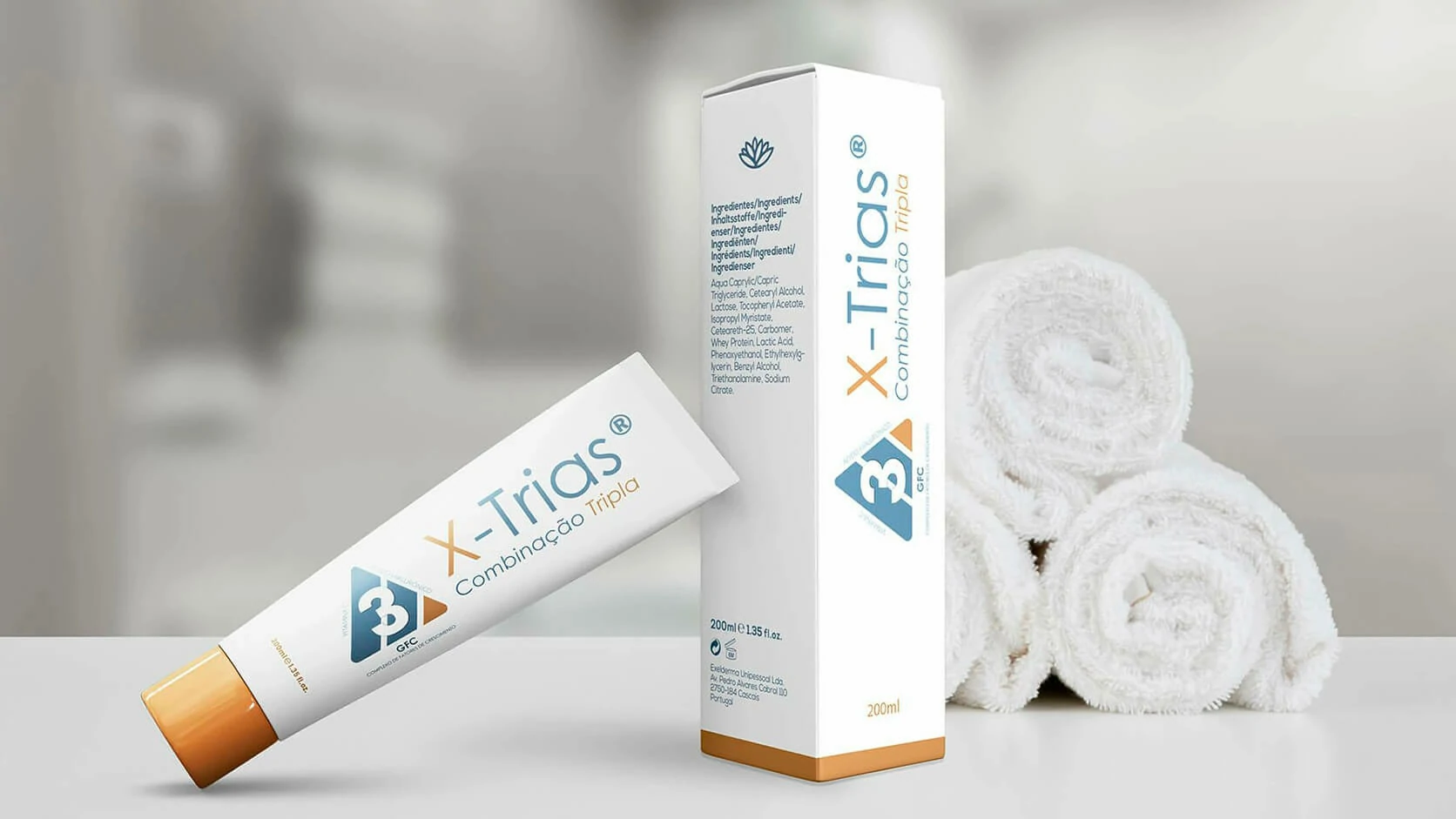
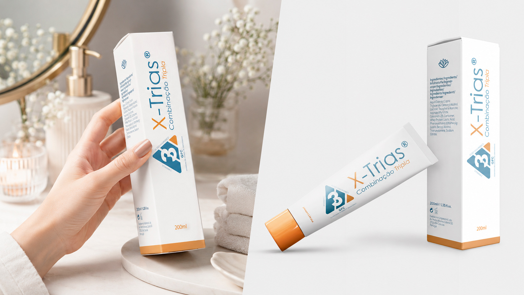
The packaging MVP applied the identity to a tube and secondary box, allowing the product’s hierarchy, colour balance, formula communication and shelf presence to be reviewed before committing to a final production route.
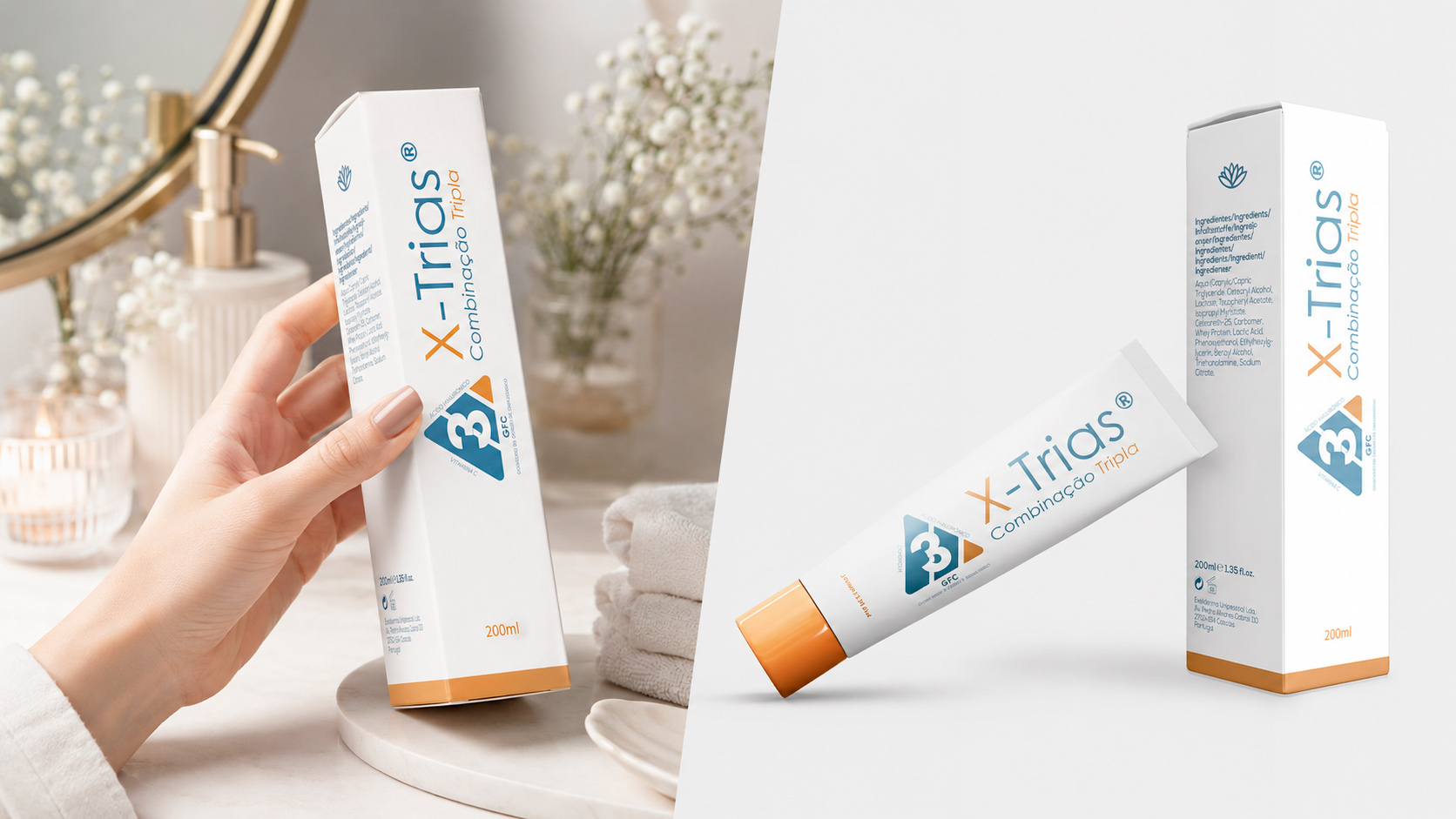
The vertical composition creates a distinctive pack face while giving the X-Trias name strong visual priority.
The symbol and ingredient references help connect the identity directly to the product’s functional proposition.
The mockups made it possible to assess scale, balance and commercial appearance without requiring an initial manufacturing run.
The layout can evolve through market feedback while preserving the core recognition elements.
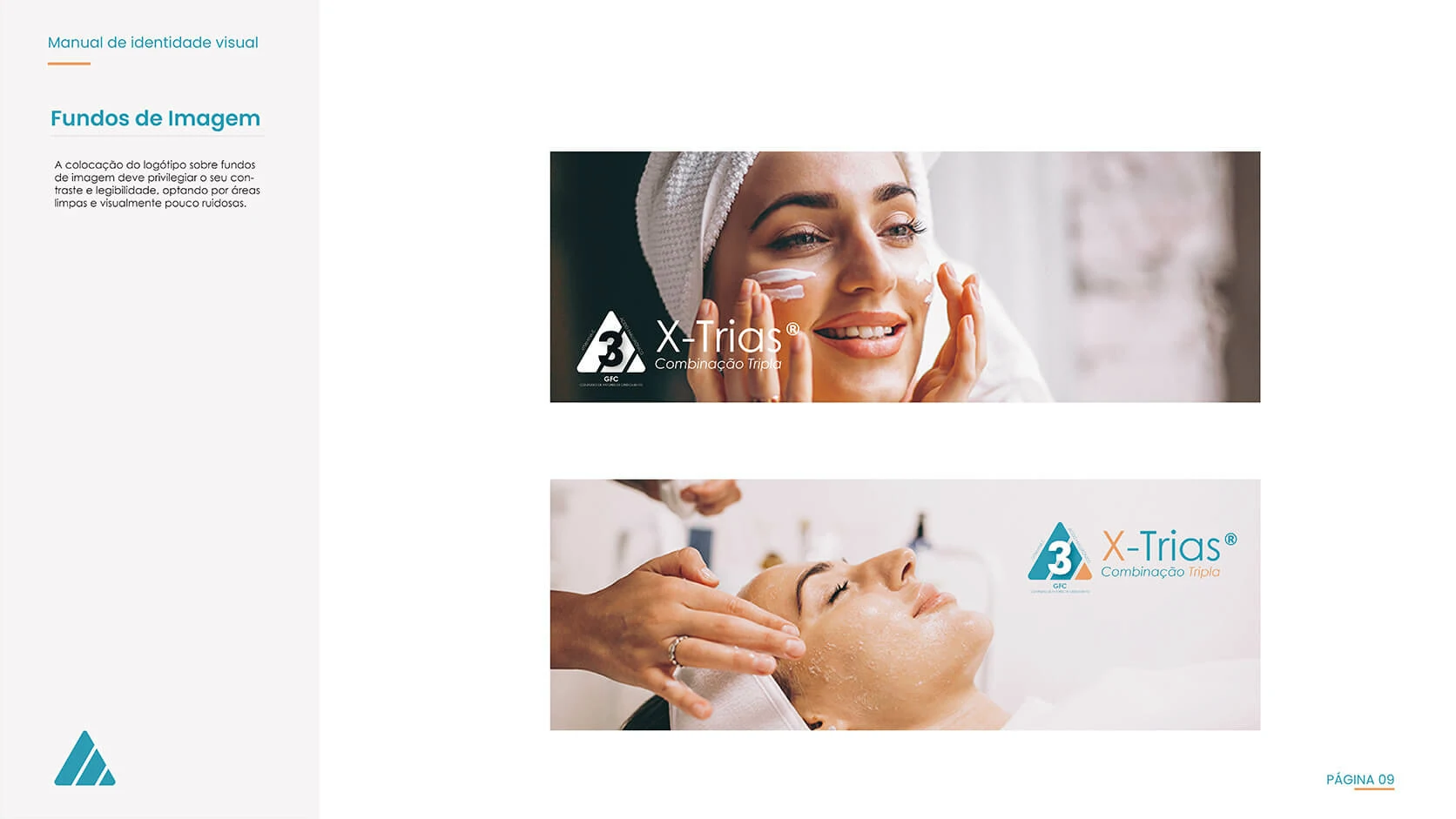
The communication MVP extended the brand into lifestyle imagery focused on skin care and treatment. This stage tested whether the symbol, wordmark and colour system could remain visible and credible within photographic compositions rather than only on white packaging.

The imagery combines treatment context with a softer, consumer-facing aesthetic.
The logo occupies controlled areas so it remains recognisable without competing with the visual story.
The materials helped demonstrate how the identity could behave in future promotional and educational applications.
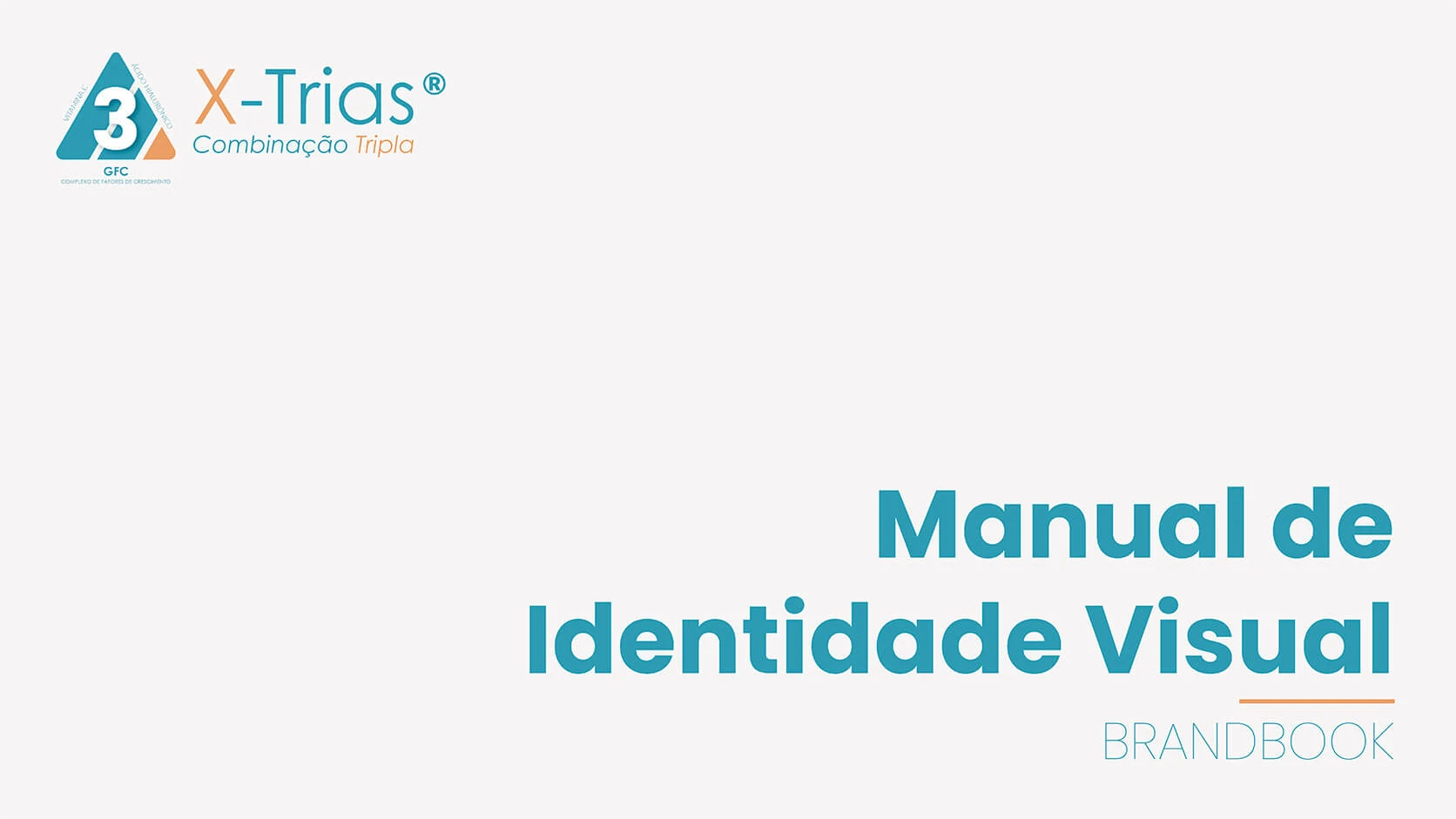
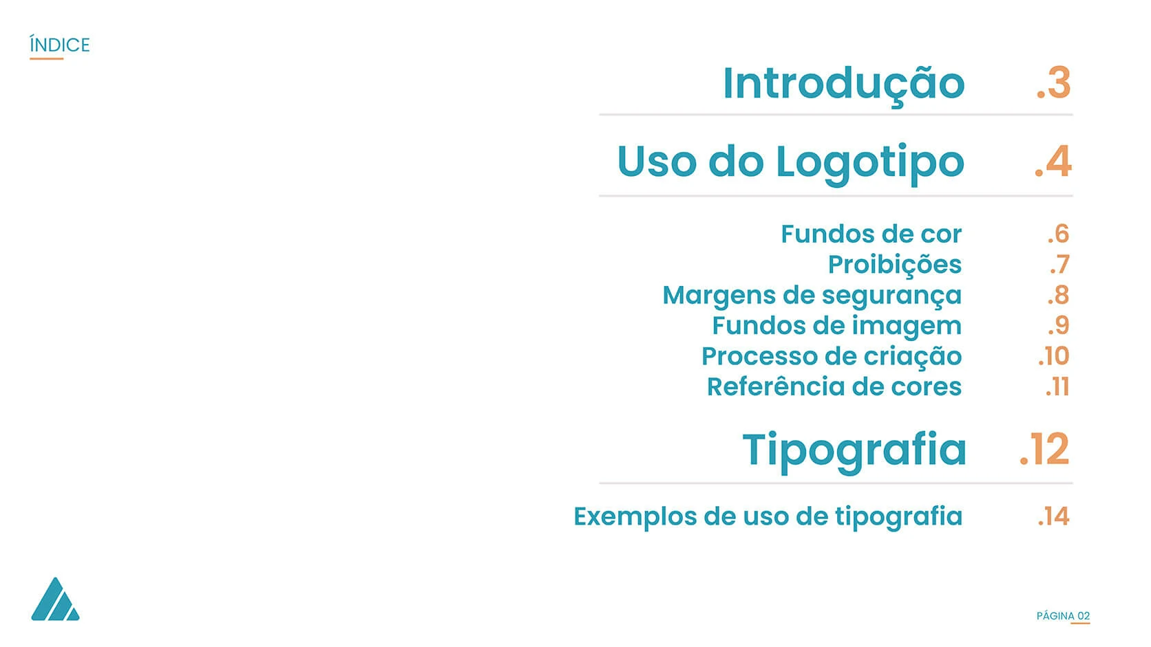
The brandbook consolidated the system into a practical reference for designers, suppliers and communication partners. It covered logo structure, approved backgrounds, restrictions, safe margins, image use, construction process, colour references, typography and examples of application.
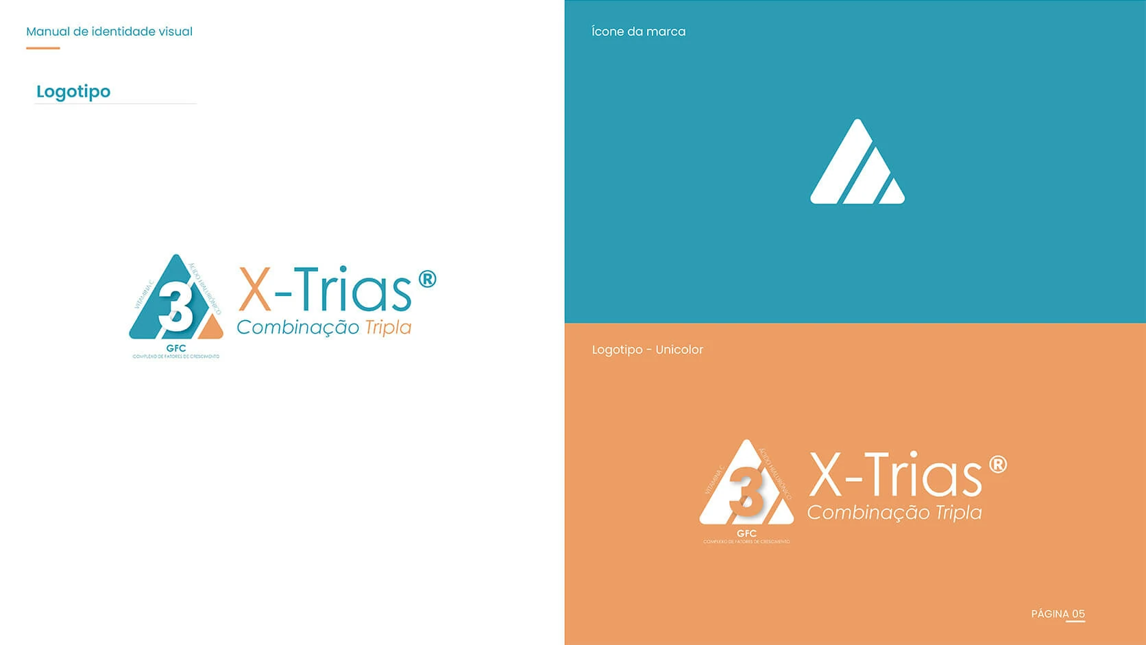
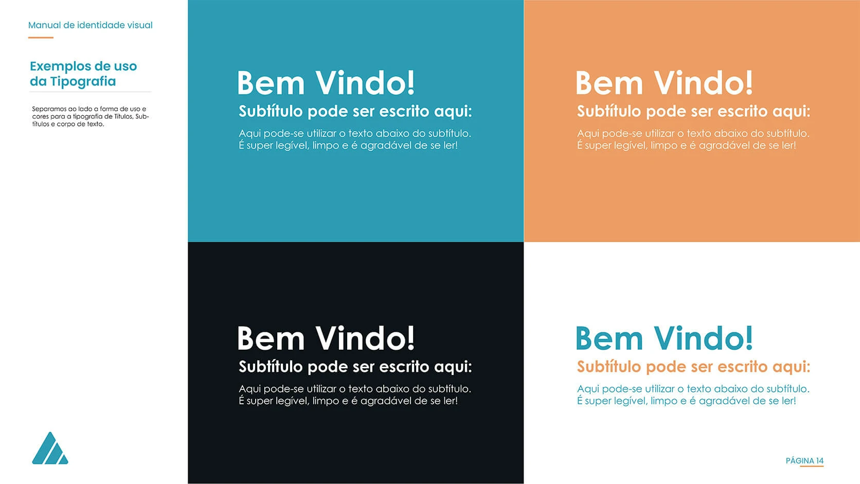
The manual transformed the identity from a single logo into a repeatable system, reducing inconsistency and giving future collaborators clear visual parameters.
The gallery includes the principal presentation, packaging mockups, campaign imagery and all fourteen pages of the visual identity manual currently selected for this case study.

The X-Trias project delivered more than a standalone logo. It created a connected visual foundation that allowed Exelderma to evaluate the product’s positioning through realistic packaging, communication applications and a documented identity system.
The triple-action concept became visible through a symbol that connects the formula, naming and commercial message.
Packaging mockups, communication materials and a complete brandbook provided the essential assets for presentation and market testing.
The documented rules make it possible to evolve the product based on consumer feedback without losing recognition or consistency.
The project reduced uncertainty by allowing the identity, packaging direction and communication potential to be assessed as one connected market proposition before wider investment.