A validated visual system for skin repair across packaging, store experience and content.
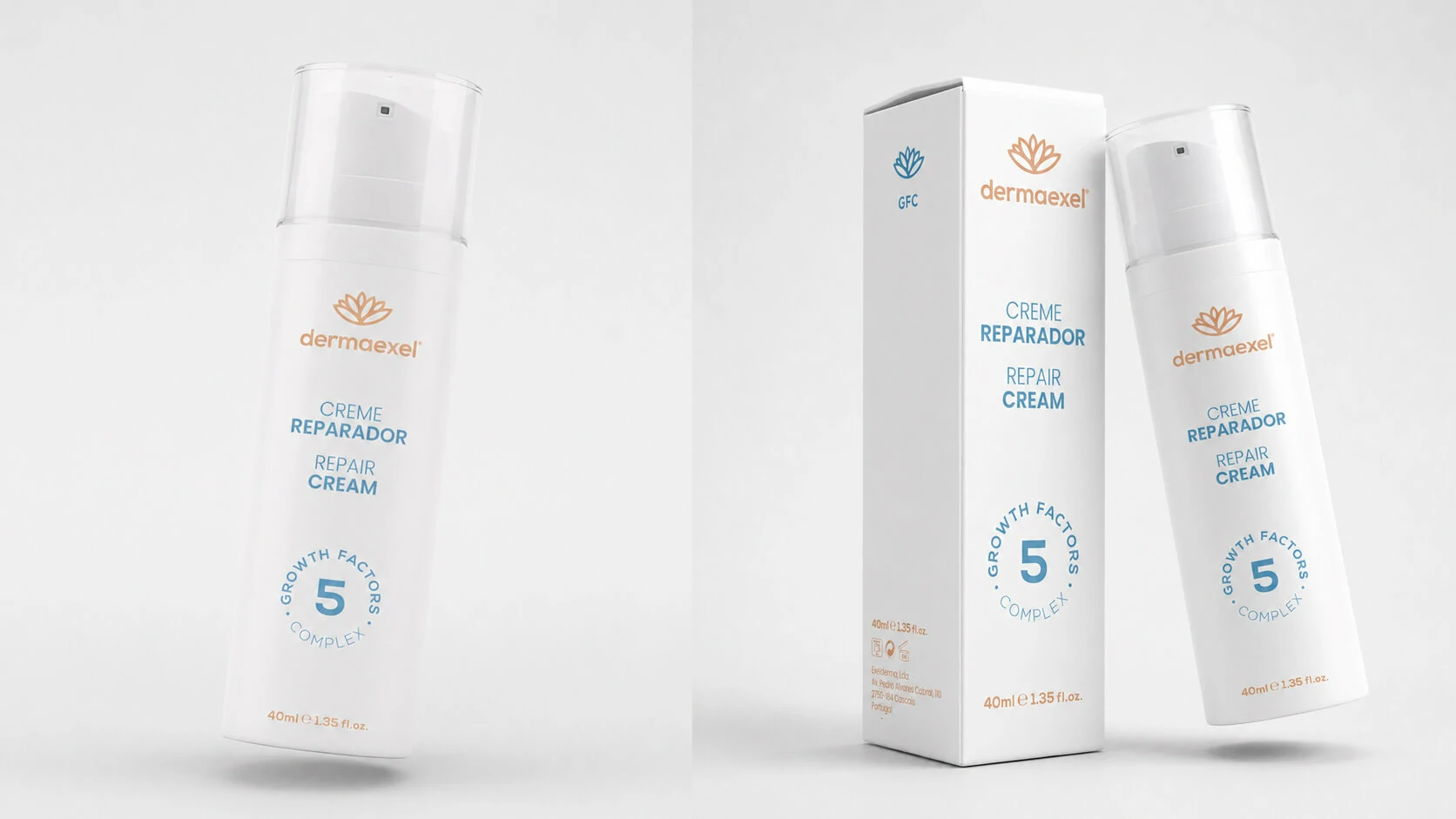
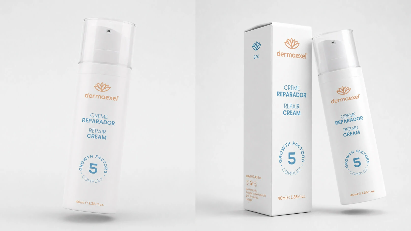
A visual MVP was developed to validate the new presentation of a specialised skin-repair product before the final packaging entered production. Using high-fidelity mockups, the project explored the minimalist visual direction, content hierarchy and the communication of Growth Factors, the product’s key active ingredient.
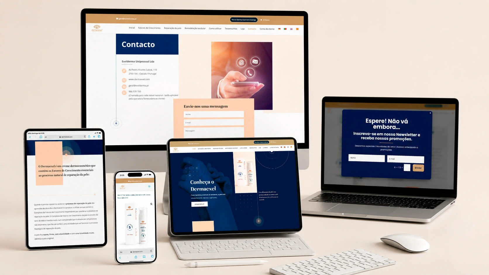
Following the validation stage, the approved visual system was extended across the physical packaging and digital experience. The Dermaexel website was refined to create a more coherent and responsive interface, combining product education, scientific content and clear conversion paths. Particular attention was given to hierarchy, readability, mobile adaptation and consistency between the brand, packaging and online store.
The existing WooCommerce environment was visually customised and improved, including the product presentation and interface details, without altering the underlying e-commerce implementation. The objective was to make the purchase journey clearer, strengthen product credibility and provide a more polished experience across desktop, tablet and mobile devices.
The broader delivery also covered the multilingual website, hosting evaluation, server and cPanel configuration, MySQL database and user setup, DNS, privacy and legal requirements, Google Maps integration, security hardening and analytics preparation through Google Tag Manager.
Project typeVisual MVP + product ecosystem
Packaging design, e-commerce visual customisation and digital communication united under one system.
Primary usersPatients, clinics and online buyers
The experience had to balance clinical credibility, product education and a clearer route to purchase.
Core goalValidate and scale a new presentation
The system had to work before production, then remain consistent across packaging, website and social media.
02 · My role
From concept validation to a coherent multi-channel product presentation.
My role combined product presentation design, digital refinement and the operational work required to publish and support the website. The project started with high-fidelity validation mockups, then expanded into packaging, website refinement, WooCommerce visual customisation, multilingual delivery, hosting and security configuration, legal compliance, campaign tracking and an ongoing social content system aligned with the Growth Factors concept.
UX/UI and information hierarchy
Defined how the product should be presented visually and how its most important messages should be prioritised.
Content hierarchy and readability
Visual simplification
Responsive adaptation logic
Brand coherence across channels
Packaging design and mockups
Created a visual MVP to test the future packaging direction before final production approval.
High-fidelity packaging mockups
Minimalist visual direction
Growth Factors emphasis
Scalable presentation system
WooCommerce visual customisation
Improved the storefront presentation and interface details without modifying the underlying e-commerce implementation.
Product presentation refinement
Visual consistency in the store
Desktop, tablet and mobile polish
Clearer conversion paths
Platform, compliance and tracking
Prepared the website environment and the operational foundations required for privacy, security and campaign measurement.
Hosting, cPanel, database and DNS setup
GDPR consent and legal documentation
Security monitoring and login hardening
Google Tag Manager and conversion tracking
Multilingual market support
Prepared the customer-facing experience for the active European markets and their respective language variants.
German
European Portuguese
British English
Spanish
Social communication ecosystem
Extended the approved visual language into a continuous communication system for Instagram and Facebook.
Growth Factors concept communication
Editorial consistency
Portuguese-market communication
Reusable visual system for campaigns
03 · Workflow
A validation-first process that expanded into packaging, e-commerce and content.
The work evolved as a connected design system rather than isolated deliverables. First the product presentation was tested through mockups, then the approved direction was extended into the digital store, responsive website experience and social communication.
01Visual MVP direction
High-fidelity mockups were developed to test layout, tone and product communication before production.
02Validation and approval
The selected direction confirmed the minimalist packaging language and the Growth Factors narrative.
03Packaging rollout
The approved visual system was translated into the final physical packaging structure.
04Website refinement
The WordPress and WooCommerce experience was visually improved for clarity, hierarchy and responsiveness.
05Social content extension
Instagram and Facebook communication adopted the same product language and educational approach.
06Market consolidation
The system supported continued communication, sales growth and a scalable base for future products.
Validation before production
The initial mockup phase reduced visual uncertainty by allowing the product presentation to be tested and approved before packaging entered final production.
04 · Visual MVP
A high-fidelity visual prototype used to validate the product presentation.
The MVP phase focused on whether the product could communicate trust, clinical care and modern clarity through a restrained visual language. Typography, the placement of product information and the prominence of Growth Factors were tested through realistic presentation mockups.
01
The mockups acted as a decision-making tool, allowing the brand to validate visual hierarchy, packaging proportions and the balance between medical trust and premium presentation.
Direction
Minimalist white foundation
A clean background reduced visual noise and made the product feel clearer, more clinical and easier to trust.
Ingredient focus
Growth Factors as a key message
The active ingredient needed to be visible and memorable, so it became a central information point in the system.
Hierarchy
Readable bilingual presentation
Product naming and function were organised with strong readability so the package could remain elegant but informative.
Scalability
A reusable product language
The system was designed not only for one item, but as a potential base for future products in the line.
05 · Packaging system
The approved visual language was translated into a coherent physical product presentation.
After the validation stage, the same design logic moved into the physical packaging system. The result balanced medical credibility with a more polished appearance, giving the product stronger shelf presence while keeping the presentation clean and understandable.
Visual toneClinical but approachable
The design avoids excess decoration, allowing the product to feel serious, safe and modern.
Brand consistencyBlue and gold structure
The colour system reinforces brand identity while separating hierarchy and product emphasis clearly.
Product logicFoundation for future extensions
The same structure can support new SKUs, categories or collaborations with partner clinics and pharmaceutical companies.
06 · Website & e-commerce
A clearer WooCommerce presentation without changing the underlying store implementation.
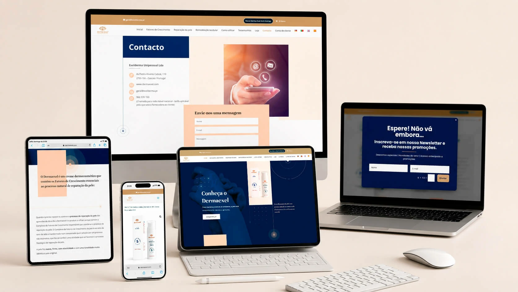
The website was refined to become more coherent and responsive, combining product education, scientific content and clearer conversion paths. The goal was not to rebuild the store logic, but to improve how the product and its information were presented to customers across desktop, tablet and mobile devices.
The visual customisation focused on content hierarchy, product credibility, multilingual consistency and a more polished purchase journey. Packaging, product information and interface details were aligned so the online store would feel like a direct continuation of the brand rather than a separate sales environment.
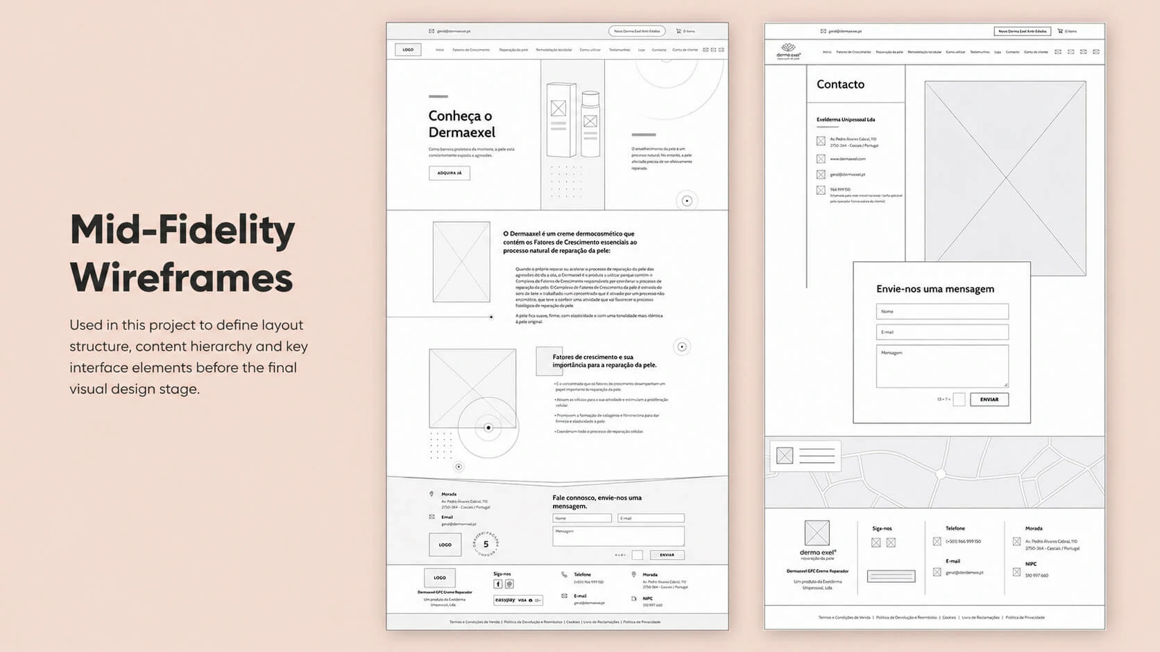
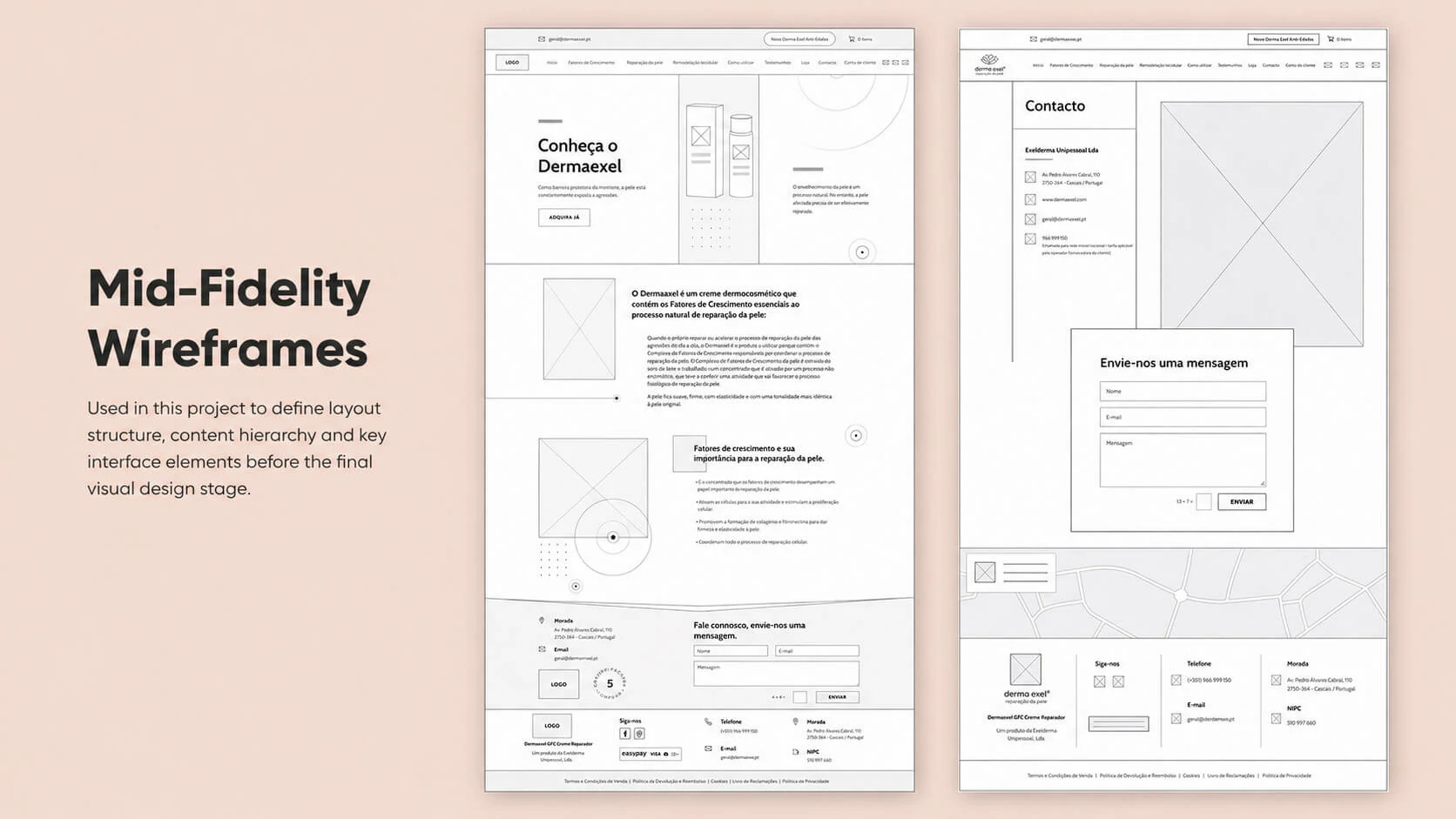
Mid-fidelity wireframes were also used to structure key layouts before the final visual refinement stage, helping define content hierarchy, interface blocks and conversion areas more clearly before the responsive views were finalised.
Clarity
More understandable product presentation
The product needed to explain itself quickly, combining educational content with a more direct route to conversion.
Responsiveness
Better adaptation across devices
Spacing, hierarchy and component behaviour were refined so the experience remained coherent on smaller screens.
Credibility
Scientific content with softer presentation
The interface balances professional trust signals with a cleaner, less intimidating visual environment.
Continuity
Packaging and website working together
The product, the page and the online store now share the same visual logic instead of behaving like separate systems.
07 · Social Media
An ongoing editorial and campaign system for Instagram and Facebook.
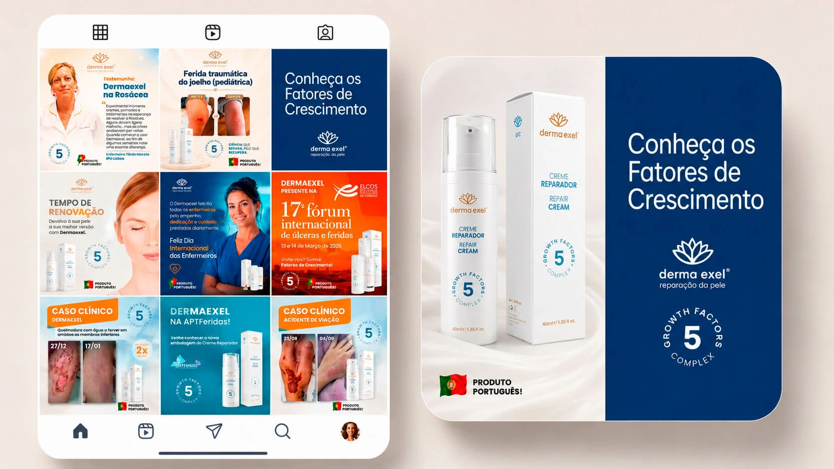
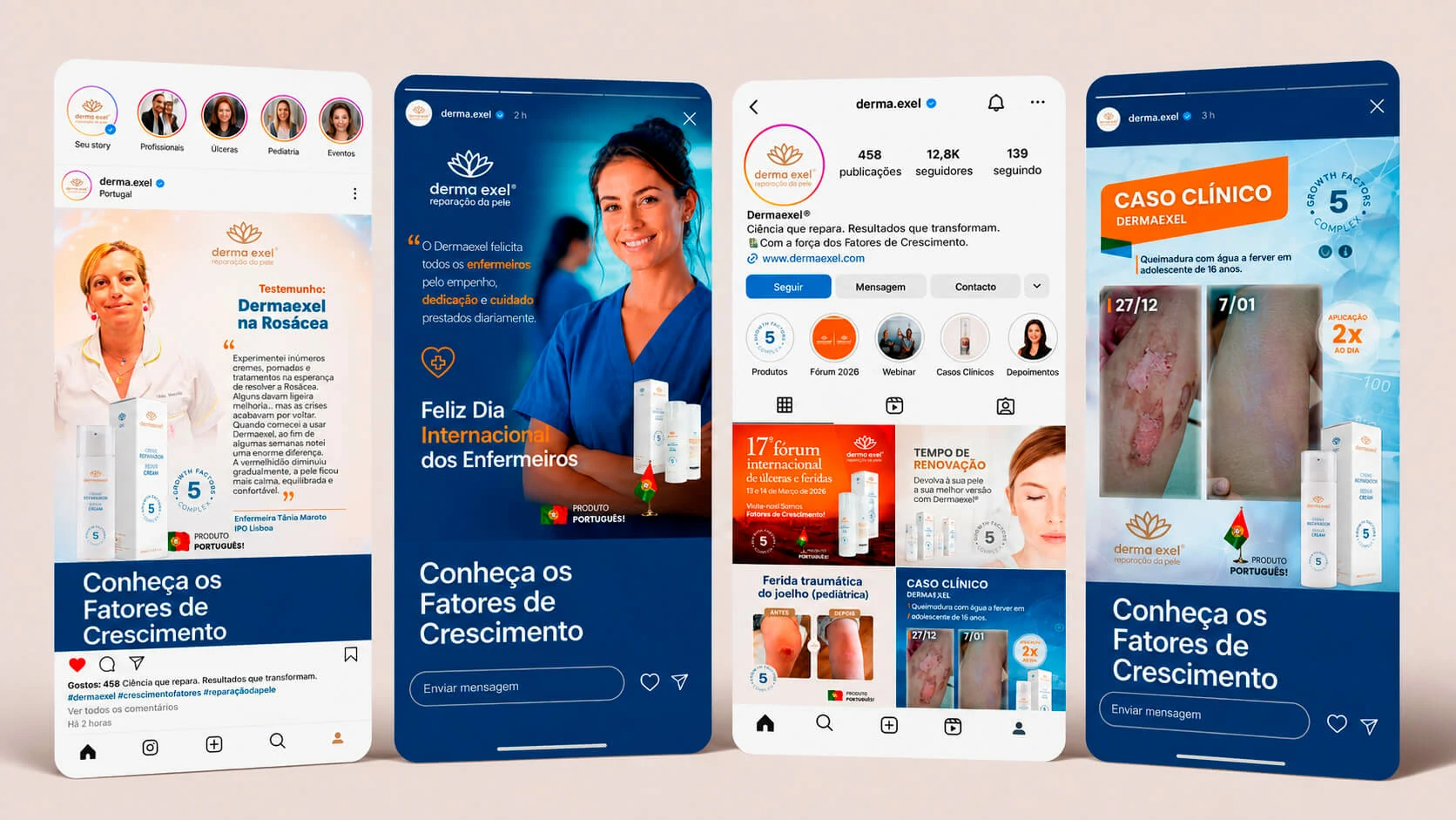
Social Media is an active and continuous part of the Dermaexel project. New posts are developed from weekly briefs supplied by the company, allowing the communication plan to respond to current priorities, clinical material, commercial opportunities and upcoming activities in the healthcare sector.
A significant part of the content is based on real product-use cases. Before-and-after material is organised into clear visual narratives that show the evolution of skin-repair treatments while maintaining a responsible and professional tone. These cases help translate clinical results into accessible communication without disconnecting the content from the brand’s scientific positioning.
The editorial calendar also covers participation in healthcare fairs, specialist forums and events focused on wound care and skin treatment. Recurring webinars are promoted through dedicated visual pieces, helping the brand communicate educational sessions, professional participation and opportunities for audiences to engage with specialists.
Commercial communication is integrated into the same visual system. Promotional campaigns support direct sales of Dermaexel Skin Repair and also introduce other products manufactured and marketed by Exelderma, including Dermaexel Anti-Stretch Marks. This approach allows the channels to support education, credibility and conversion without losing visual consistency.
Weekly briefing-based production
Content is planned and designed from the company’s weekly priorities rather than through a fixed generic calendar.
Brief interpretation and content planning
Post and story design
Visual adaptation for changing priorities
Ongoing brand consistency
Clinical cases and before-and-after content
Real use cases are transformed into structured visual narratives that communicate product application and visible treatment progress.
Before-and-after comparisons
Case chronology and context
Clear visual hierarchy
Responsible clinical presentation
Events, forums and webinars
The channels support the brand’s participation in the professional healthcare ecosystem and its recurring educational initiatives.
Healthcare fairs and forums
Wound-care and skin-treatment events
Webinar promotion
Professional and institutional communication
Promotions and product portfolio
Campaigns combine brand education with commercial calls to action for Dermaexel and related Exelderma products.
Sales promotions
Dermaexel Skin Repair campaigns
Dermaexel Anti-Stretch Marks communication
Cross-product visual consistency
PlatformsInstagram and Facebook
Feed posts, stories and campaign formats maintain a continuous presence around the brand and its products.
Editorial pillarsClinical evidence, education, events and sales
The content system balances healthcare communication, product credibility and commercial objectives.
Portfolio coverageDermaexel and Dermaexel Anti-Stretch Marks
The visual framework supports communication for more than one product while preserving the Exelderma brand relationship.
08 · Infrastructure & localisation
A multilingual WordPress environment prepared from hosting selection to production delivery.
The website was developed in WordPress using Divi, with the broader implementation covering the evaluation of a suitable hosting solution, server and cPanel configuration, MySQL database and user creation, DNS setup and the technical preparation required to operate the site reliably.
The customer-facing experience was prepared in German, European Portuguese, British English and Spanish, supporting content and sales across Portugal, Spain and Germany. Google Maps was also integrated where location context and access information needed to be presented clearly.
Platform deliveryWordPress + Divi environment
The website structure, visual customisation and responsive behaviour were managed within a maintainable WordPress setup.
InfrastructureHosting, cPanel, MySQL and DNS
The operational environment was configured from database creation and users through to domain routing and production readiness.
LocalisationFour market-ready languages
German, European Portuguese, British English and Spanish supported a more appropriate experience for each active market.
Location support
Google Maps integration provided a clear location reference within the wider customer journey, complementing contact and trust information.
09 · Compliance, security & tracking
Legal, privacy, security and measurement foundations were treated as part of the product experience.
The legal documentation was updated to cover sales terms, returns, refunds, cookies and privacy, with integration with Portugal’s Electronic Complaints Book. GDPR cookie consent management was configured so visitors could understand their choices and control non-essential cookies.
Security measures supported malware monitoring, file-integrity checks, firewall protection, login hardening and ongoing auditing. Google Tag Manager was configured to support Google Ads campaign tracking, conversion measurement and website-performance analysis, providing a more reliable foundation for optimisation and remarketing.
Legal clarity
Commerce policies and consumer rights
Sales, returns, refunds, cookie and privacy information were structured to support a more transparent e-commerce relationship.
GDPR
Consent choices with user control
Non-essential cookies were managed through a consent layer designed to present clearer privacy options.
Security
Monitoring, hardening and auditing
The production environment included multiple defensive layers rather than relying on a single security setting.
Measurement
Google Tag Manager and conversions
Campaign and behavioural data could be collected more consistently for Google Ads optimisation and remarketing workflows.
10 · Technical stack
A product ecosystem combining design, commerce, infrastructure, compliance and multilingual delivery.
The project combined UX/UI decisions and front-end visual refinement with WordPress administration, Divi implementation, WooCommerce customisation, server configuration, localisation, privacy controls, security and campaign measurement. The website supports content and sales in German, European Portuguese, British English and Spanish.
WordPress + DiviWebsite structure, content administration and responsive visual implementationWooCommerceExisting e-commerce environment visually refined for clearer presentationUX/UI DesignHierarchy, readability, responsive refinement and conversion clarityPackaging DesignVisual system translated into physical product presentationVisual MockupsHigh-fidelity MVPs used for validation before productionResponsive customisationDesktop, tablet and mobile visual adjustmentscPanel + MySQL + DNSHosting environment, database users, domain routing and production configurationMultilingual deliveryGerman, European Portuguese, British English and SpanishGoogle MapsLocation context integrated into the customer-facing experienceGDPR & legal contentConsent controls, privacy, cookies, sales, returns and refund documentationWebsite securityMonitoring, file integrity, firewall, login hardening and security auditsGoogle Tag ManagerGoogle Ads tracking, conversions, performance analysis and remarketing supportInstagram & FacebookWeekly briefing-based production, clinical cases, webinars, events, promotions and multi-product communication
E-commerce scope note
The project improved the visual and communication quality of the WooCommerce experience without altering the underlying store implementation.
11 · Full project gallery
Browse the current Dermaexel visual boards.
The gallery gathers the packaging presentation, website refinements, validation mockups and digital communication boards currently selected for this case study.
12 · Outcome and learning
A more coherent product ecosystem with room to grow.
The positive market response and steady sales growth have supported the consolidation of the product in its active markets. The resulting design system has also created a scalable foundation for the development of new products in collaboration with pharmaceutical companies and partner clinics.
Commercial clarity
The store and product presentation became clearer, helping the purchase journey feel more credible and polished.
Brand consistency
Packaging, website and an ongoing weekly Social Media operation now share the same visual language and message hierarchy.
Scalable foundation
The approved system can support future product extensions, new collaborations and continued digital communication.
Operational resilience
Hosting, multilingual delivery, privacy, security and measurement were integrated into the project rather than treated as separate afterthoughts.
Multi-market support
The website and content system support sales and communication across Portugal, Spain and Germany, with multilingual delivery in Portuguese, Spanish, German and English.



An ongoing editorial and campaign system for Instagram and Facebook.
Social Media is an active and continuous part of the Dermaexel project. New posts are developed from weekly briefs supplied by the company, allowing the communication plan to respond to current priorities, clinical material, commercial opportunities and upcoming activities in the healthcare sector.
A significant part of the content is based on real product-use cases. Before-and-after material is organised into clear visual narratives that show the evolution of skin-repair treatments while maintaining a responsible and professional tone. These cases help translate clinical results into accessible communication without disconnecting the content from the brand’s scientific positioning.
The editorial calendar also covers participation in healthcare fairs, specialist forums and events focused on wound care and skin treatment. Recurring webinars are promoted through dedicated visual pieces, helping the brand communicate educational sessions, professional participation and opportunities for audiences to engage with specialists.
Commercial communication is integrated into the same visual system. Promotional campaigns support direct sales of Dermaexel Skin Repair and also introduce other products manufactured and marketed by Exelderma, including Dermaexel Anti-Stretch Marks. This approach allows the channels to support education, credibility and conversion without losing visual consistency.
Weekly briefing-based production
Content is planned and designed from the company’s weekly priorities rather than through a fixed generic calendar.
Clinical cases and before-and-after content
Real use cases are transformed into structured visual narratives that communicate product application and visible treatment progress.
Events, forums and webinars
The channels support the brand’s participation in the professional healthcare ecosystem and its recurring educational initiatives.
Promotions and product portfolio
Campaigns combine brand education with commercial calls to action for Dermaexel and related Exelderma products.
Feed posts, stories and campaign formats maintain a continuous presence around the brand and its products.
The content system balances healthcare communication, product credibility and commercial objectives.
The visual framework supports communication for more than one product while preserving the Exelderma brand relationship.