
Personal tribute · Branding & Packaging
O Viking
A bespoke wine identity and label concept created as a family tribute to a father remembered for his strength, courage and unusually generous heart.
A bespoke wine identity and label concept created as a family tribute to a father remembered for his strength, courage and unusually generous heart.
O Viking began with a deeply personal request: create a wine identity that could honour a father whose family described him as strong-willed, courageous and protective, yet equally known for his warmth and generous heart.
The project transformed those memories into a visual narrative. Instead of using generic premium-wine codes alone, the identity was built around a symbolic character — an elder Viking whose commanding presence is balanced by expressive facial detail and a carefully structured, almost ceremonial composition.
The result is a concept system extending from the central symbol and wordmark to the bottle label, neck application, colour palette and presentation mockups. Every element was designed to make the tribute feel personal, memorable and worthy of being kept as an object of family significance.
A commemorative wine identity developed around the personality and memory of the person being honoured.
The design balances visual power, dignity and emotional warmth rather than portraying strength as aggression alone.
The label and presentation needed to communicate character before any supporting story was read.
The family’s description shaped the entire creative direction. The man being honoured was remembered as someone with unmistakable presence: direct, brave and resilient, but also caring and generous with the people around him. The Viking metaphor emerged naturally as a way to express these apparently contrasting qualities through one recognisable archetype.
The concept also acknowledges the family’s Danish heritage and its connection with Brazil. Nordic references, ceremonial framing and runic-style inscriptions give the label a sense of origin and legacy, while the wine format turns the tribute into something that can be shared during meaningful occasions.
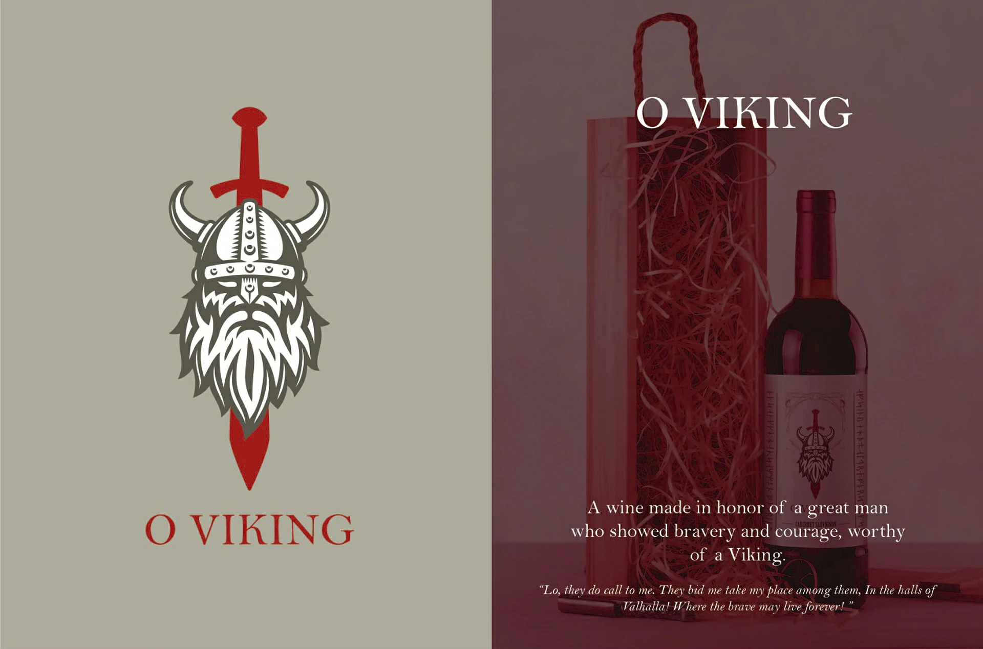
The brand does not simply place a Viking on a bottle. It uses the Viking as a symbolic portrait: a visual shorthand for courage, authority, loyalty and a generous spirit remembered by the family.
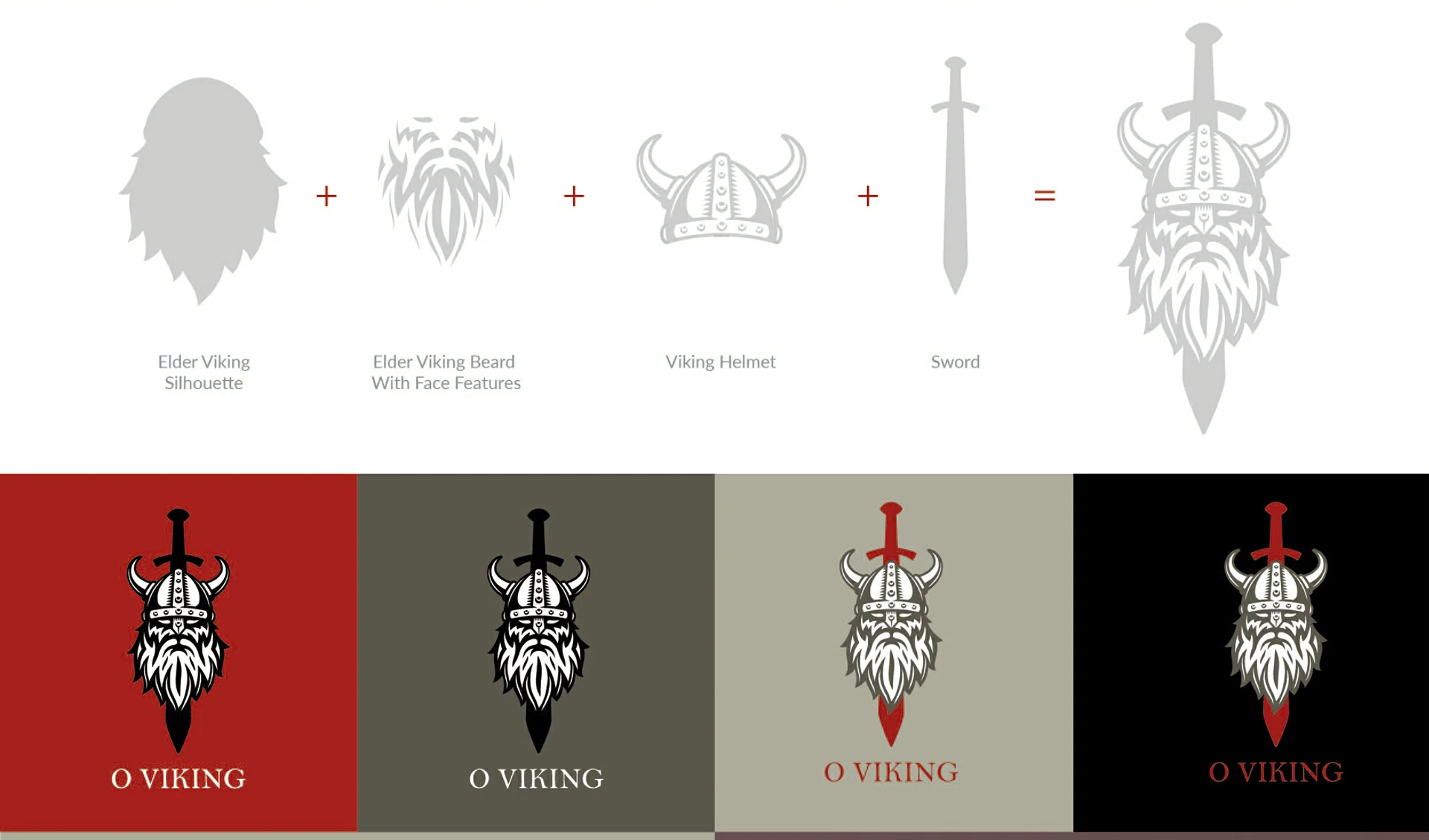
The main symbol was developed by combining four visual components: the silhouette of an elder Viking, a detailed beard with visible facial features, a helmet and a sword. The construction process allowed the character to feel layered and expressive while remaining readable as one compact mark.
The sword forms the vertical axis of the composition, giving the emblem structure and authority. The face and beard introduce humanity, while the helmet reinforces the Nordic narrative. Together, these elements create a mark that works both as an illustration and as a recognisable identity asset.
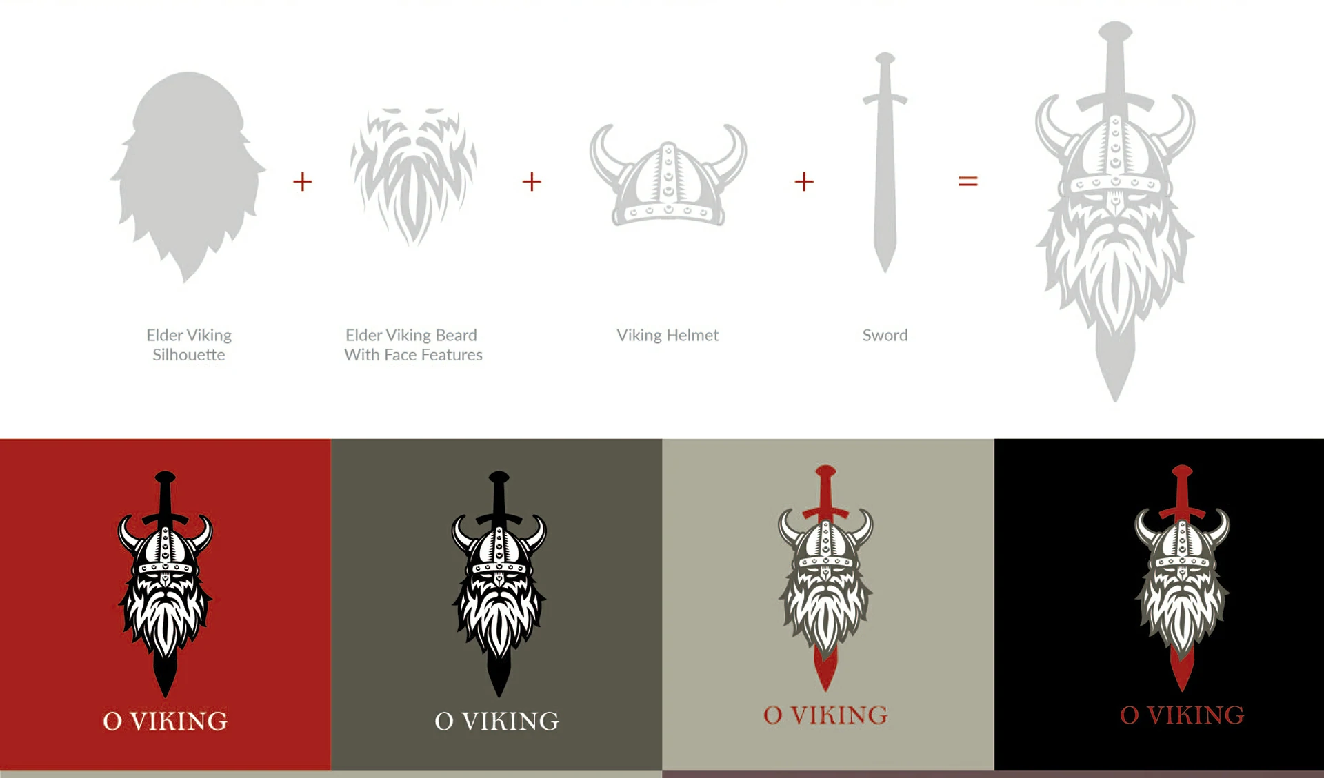
The beard and facial details prevent the emblem from becoming a generic warrior icon and give it a more personal presence.
The sword creates a strong central axis and visually supports the ideas of courage, protection and determination.
The helmet and runic-style framing connect the concept to Danish heritage without requiring a literal historical scene.
Colour variations demonstrate how the symbol can remain recognisable across dark, light and red backgrounds.
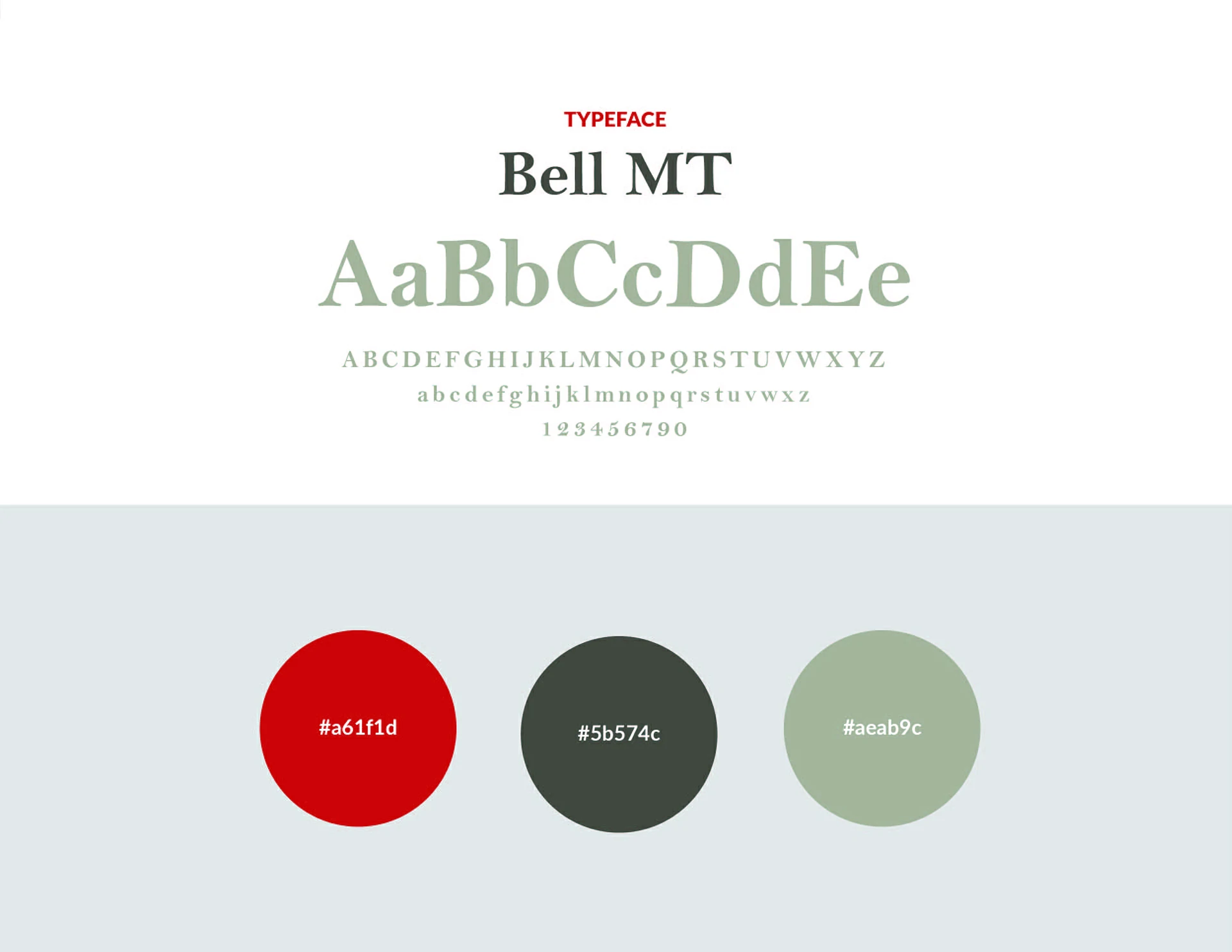
The identity uses Bell MT to reinforce an elegant, traditional and slightly literary tone. Its serif forms support the commemorative nature of the project and contrast with the more illustrative construction of the Viking emblem.
The colour palette combines a deep red, charcoal grey and muted sage. Red brings courage and emotional intensity; charcoal adds maturity and strength; the softer green-grey introduces balance and prevents the composition from feeling excessively aggressive.
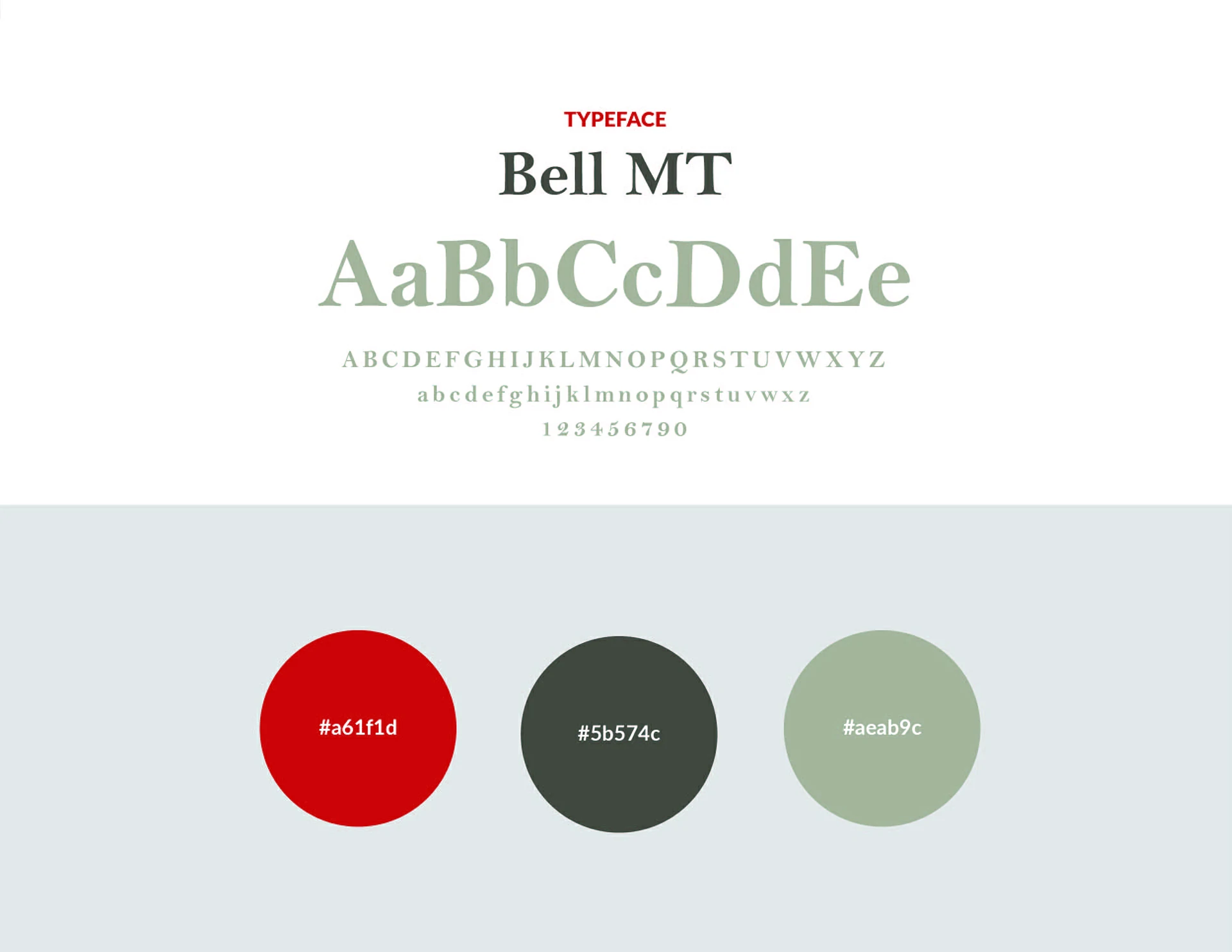
A classic serif family selected to give the name dignity, tradition and a commemorative tone.
The palette balances bravery, maturity and emotional restraint across the label and mockups.
Decorative references create atmosphere while keeping the main identity centred on the portrait-like emblem.
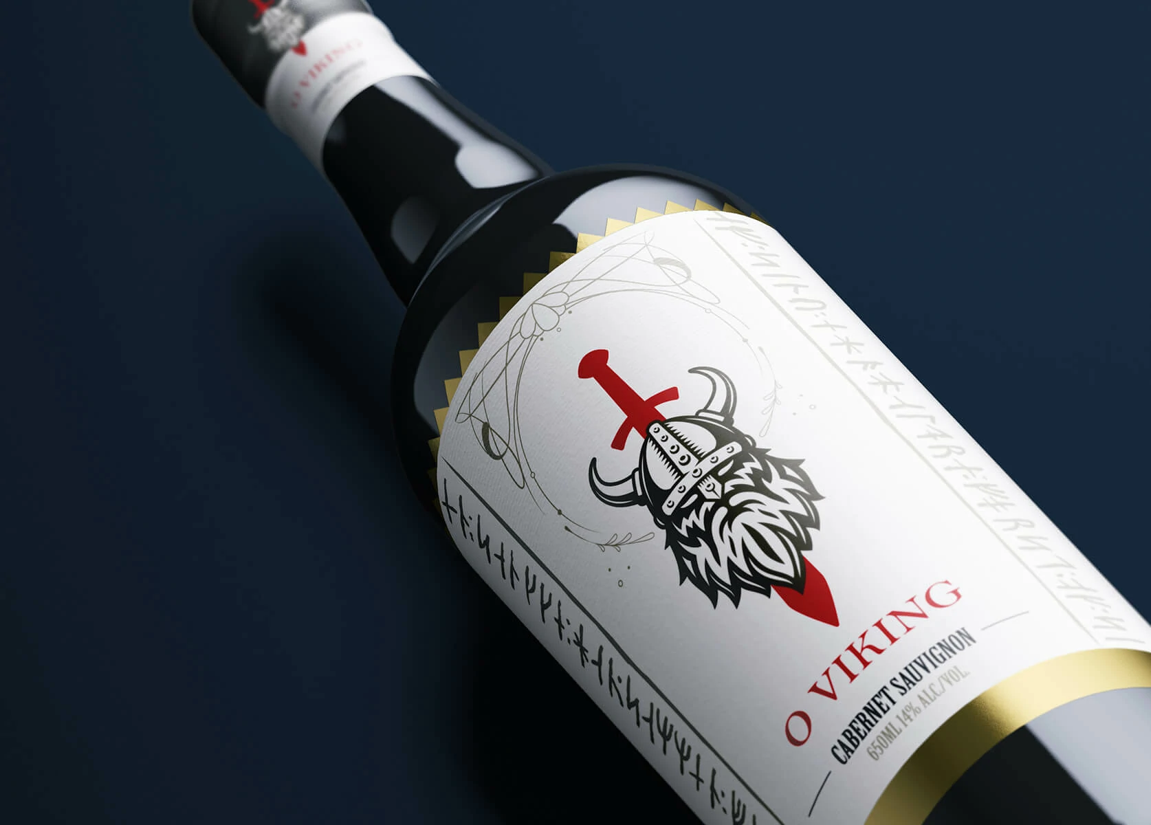
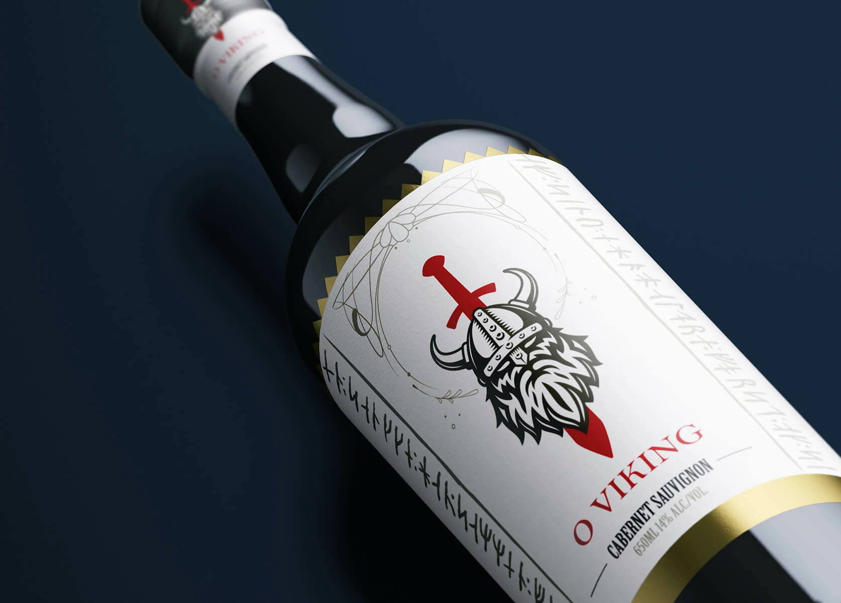
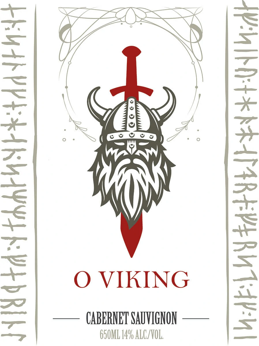
The label places the Viking symbol at the centre of the composition, allowing the character to become the immediate focus. The name appears below in red, while the Cabernet Sauvignon designation is set with a narrower, contrasting typographic treatment to preserve hierarchy.
Decorative linework and Nordic-inspired inscriptions run along the sides, framing the label and reinforcing the cultural reference. The use of white space ensures that these details enrich the story without competing with the emblem.
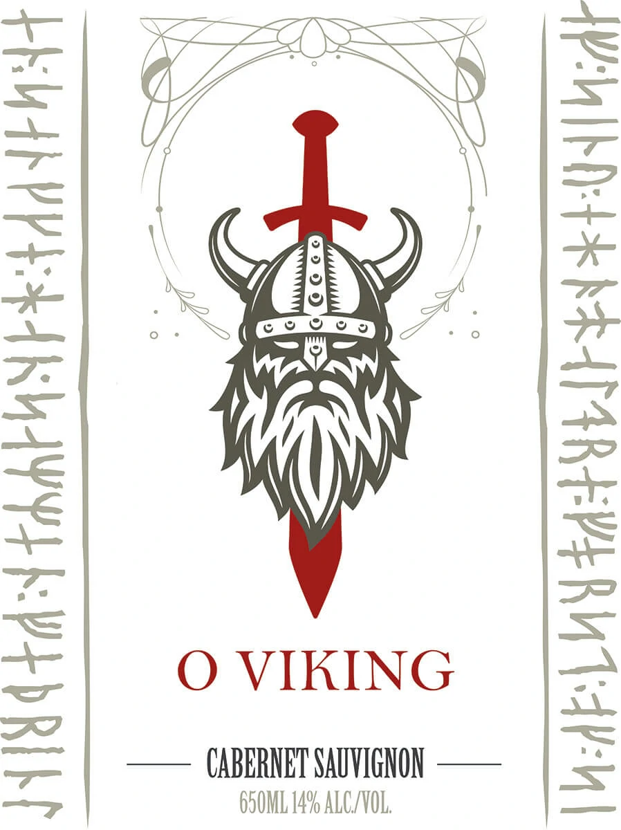
The tribute identity is given visual priority over the technical wine information. This makes the bottle feel like a commemorative object first, while still preserving the expected product hierarchy.
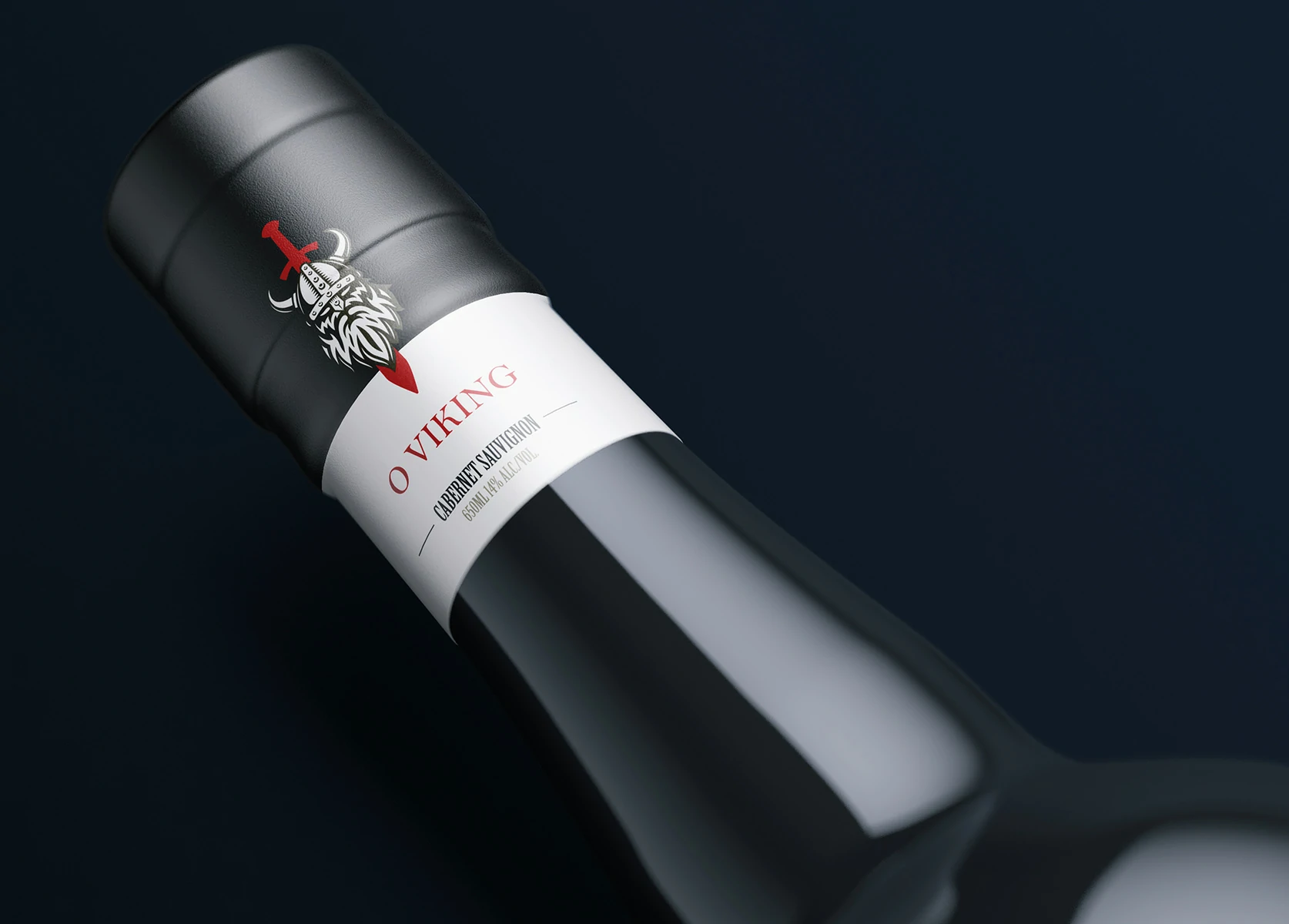
High-fidelity mockups were created to evaluate the concept on a dark wine bottle, where the white label and deep red details gain strong contrast. The emblem also extends onto the neck, allowing the identity to remain visible from multiple viewing angles.
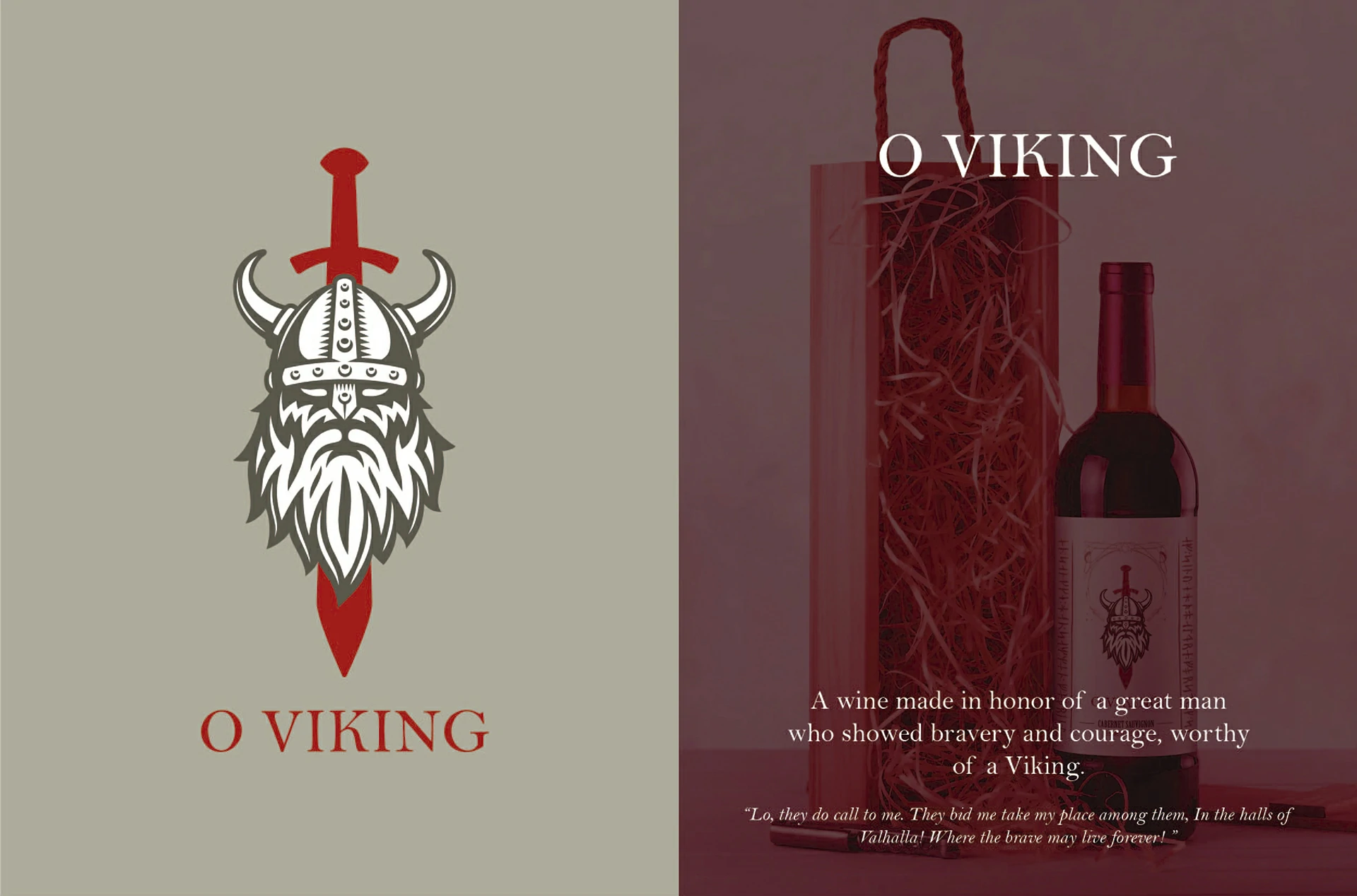
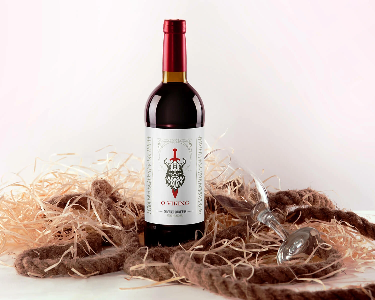
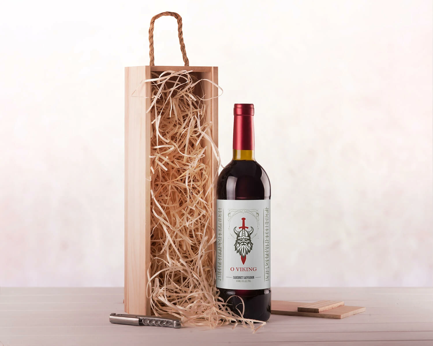
The presentation was expanded into lifestyle and gift-box scenarios to show how the tribute could be offered, displayed and photographed. These compositions helped validate scale, legibility and emotional impact before any physical production decision.
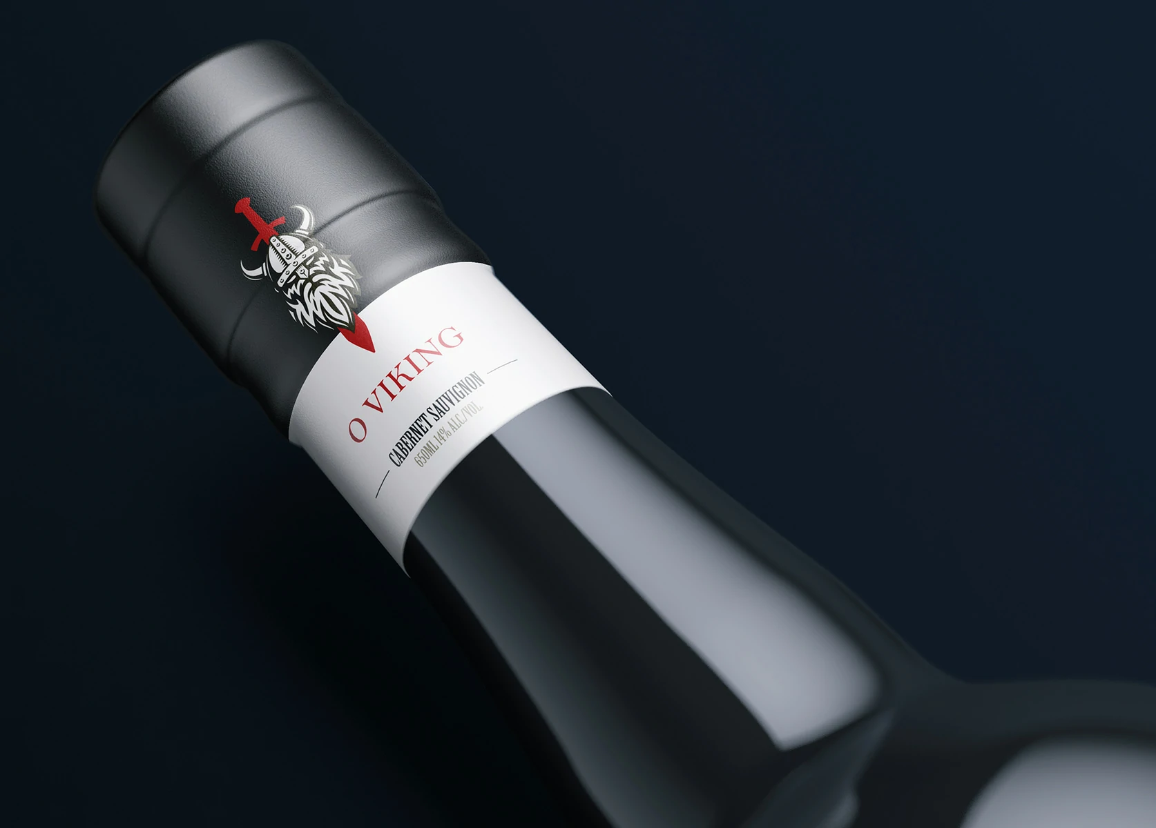
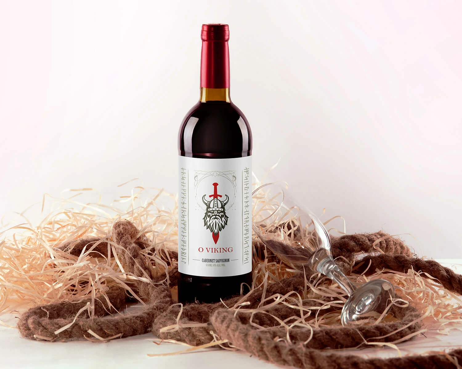
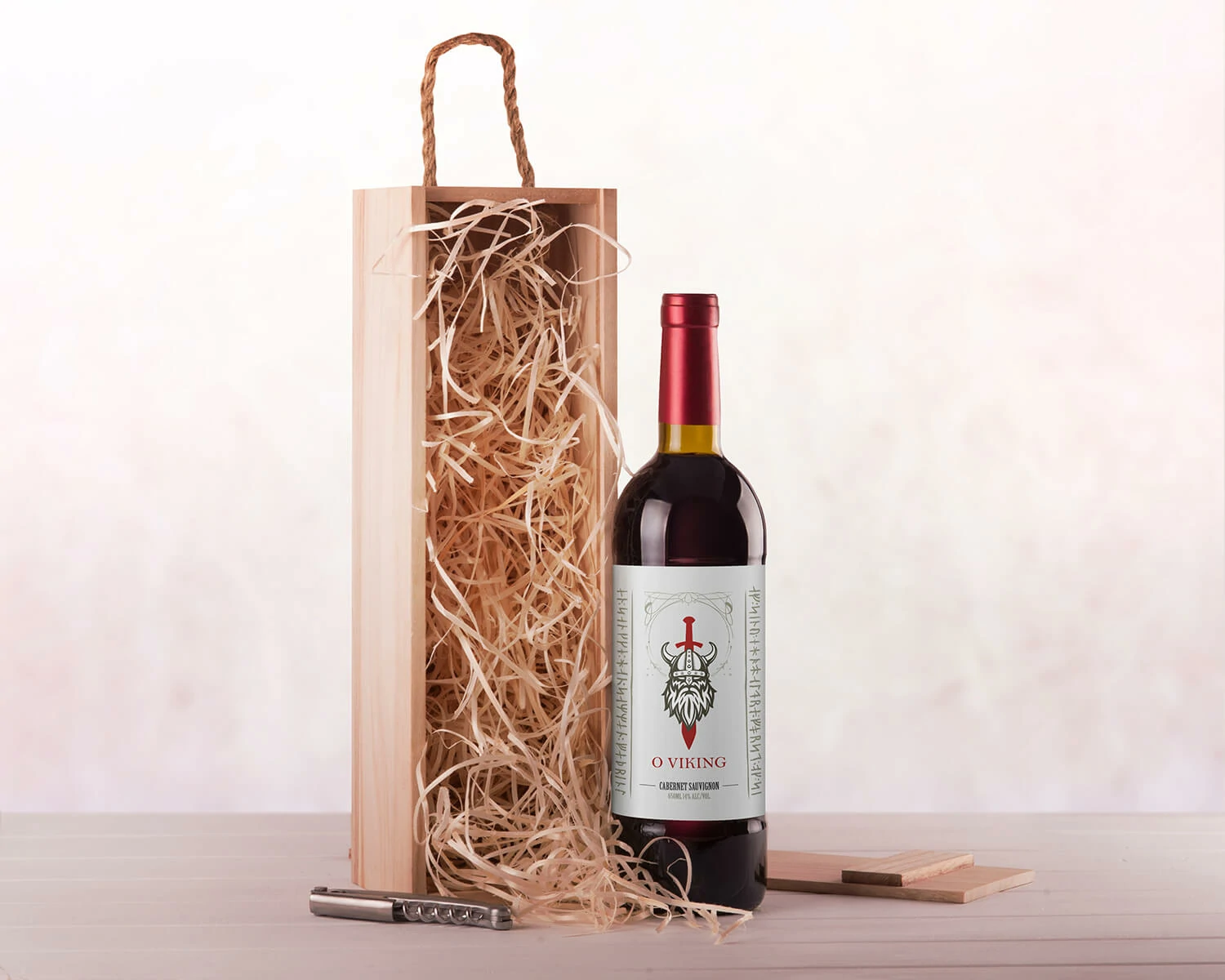
The gallery brings together the main label close-up, storytelling board, symbol construction, visual identity system, complete artwork and packaging presentation mockups.
O Viking demonstrates how branding can move beyond commercial positioning and become a tool for preserving memory. The final concept connects the person’s character, the family’s cultural background and the ritual of sharing wine through one consistent visual system.
The emblem communicates strength and Nordic heritage while retaining enough human detail to feel connected to a real person.
Typography, colours, label artwork and mockups work together rather than presenting the tribute as a standalone illustration.
The high-fidelity mockups make it possible to evaluate production, gifting and presentation scenarios before manufacturing.
The strongest solution came from treating personality traits as design inputs. Courage shaped the sword and red accents; authority informed the central structure; generosity was expressed through the more human face and the warm, gift-oriented presentation.