
Industrial Branding · Mini Guidelines
Tecshape
A concise visual-identity system translating customised metalworking, technical expertise and high-precision production into a direct, contemporary and operationally useful brand.
A concise visual-identity system translating customised metalworking, technical expertise and high-precision production into a direct, contemporary and operationally useful brand.
Tecshape is a Lisbon-based company within the Sotecnisol Group, specialising in customised metalworking solutions that combine technical expertise, traditional craftsmanship, advanced equipment and high-precision production processes.
The project involved the creation of a concise brand-guideline document capable of organising the company’s core visual assets and establishing a reliable standard for future communication. Rather than producing an extensive manual, the objective was to define the essential rules required for consistent day-to-day use.
The final system gives Tecshape a direct and contemporary visual language aligned with industrial production, engineering precision and the transformation of materials. It is structured to remain practical for teams, suppliers and communication partners who need to apply the brand quickly and correctly.
The identity needed to represent both hands-on manufacturing expertise and access to advanced technical processes.
A focused set of rules organises the essential brand elements while remaining easy to consult and implement.
Typography, colour and application logic create continuity across light, dark, photographic and institutional contexts.
Industrial brands often rely on familiar visual codes such as metallic greys, heavy type and mechanical imagery. While these elements can signal the sector, they can also make different companies feel interchangeable. Tecshape required an identity with enough technical credibility to feel appropriate for metalworking, but enough personality to remain memorable.
The guide also had to solve an operational problem: defining how the logo should behave across different backgrounds and preventing inconsistent colour, contrast or hierarchy as the company produced new materials.
The system had to feel connected to engineering, fabrication and material transformation without relying on decorative industrial clichés.
A strong wordmark and focused palette needed to remain identifiable in both large-format and compact applications.
The brand required reliable variants for light, green, dark and photographic backgrounds.
The final document needed to guide real production work without becoming difficult to consult or maintain.
Tecshape combines two complementary ideas. “Tec” refers to technology, technique and specialist knowledge; “shape” refers to form, construction and the physical transformation of materials. Together, they describe the company’s ability to convert technical requirements into precisely manufactured solutions.
This conceptual connection made it possible to build the identity around action rather than ornament. The brand communicates a process: technical intelligence is applied to material until the required form is achieved.
Technology defines the method. Shape represents the result. The visual identity connects both concepts through one compact and performance-oriented wordmark.
The wordmark uses a bold, forward-leaning typographic construction to communicate movement, speed and execution capability. Its direct silhouette supports visibility and gives the brand a contemporary industrial tone without depending on a separate illustrative symbol.
The primary green differentiates Tecshape from conventional metalworking identities and introduces energy, innovation and progress. Grey creates a natural connection with metal, structural systems, machinery and engineering discipline. The two colours work together to balance visibility with technical solidity.
The primary colour brings energy, differentiation and a more progressive character to the industrial positioning.
The supporting tone reinforces associations with metal, precision, structural systems and technical reliability.
The forward movement of the typography expresses performance, production rhythm and transformation.
The identity was tested on the primary green field, neutral light backgrounds and high-contrast photographic environments. Each version preserves the relationship between the Tecshape wordmark and the Sotecnisol endorsement while adapting colour to maintain clarity.
This application logic is especially important for an industrial company, where the brand may appear across presentations, uniforms, vehicles, signage, equipment, digital interfaces and technical photography with very different levels of visual noise.
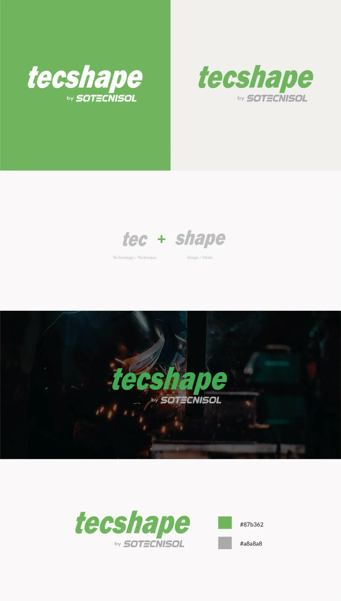
The document presents the primary and reversed logo variants, the relationship between “tec” and “shape,” the approved photographic application and the institutional colour palette. Its structure was intentionally concise, turning the guide into a quick-reference tool rather than a static presentation.
From an information-design perspective, each section answers one operational question: which version should be used, what the name communicates, how the logo behaves over imagery and which colours define the brand. This clear scope reduces interpretation and makes correct application easier.
Approved light and colour combinations provide practical options while limiting uncontrolled adaptations.
The naming logic gives future communication teams a consistent strategic narrative for the brand.
Photographic and flat-colour examples demonstrate the contrast required for reliable recognition.
The primary palette creates a shared reference for digital and graphic-production workflows.
The purpose of a mini guideline is not to anticipate every future touchpoint. It is to define a stable visual core from which new applications can be developed. For Tecshape, that core includes wordmark proportions, endorsement hierarchy, contrast behaviour and the green-grey colour relationship.
This provides a practical foundation for future materials while allowing the brand to expand into signage, digital interfaces, proposals, uniforms, documentation and environmental applications without losing recognition.
A concise system is effective when every included rule solves a recurrent production decision. Clarity of use is more valuable than guideline volume.
The gallery presents the main identity in context and the concise guideline developed to organise its meaning, variants, photographic behaviour and colour system.
The resulting mini guideline gives Tecshape a practical visual foundation for future communication. The system reinforces the relationship between technical knowledge and material transformation, while the logo variants and colour rules reduce inconsistency across production contexts.
The identity communicates technology, fabrication and execution capability through one direct visual language.
Approved variants and contrast examples make everyday decisions easier for internal and external teams.
The wordmark, endorsement hierarchy and palette provide a stable base for future brand touchpoints.
Brand-guideline quality is not measured by page count. A compact system can provide strong governance when it captures the strategic meaning of the brand and resolves the visual decisions that teams face most often.