
Packaging System · Brand Architecture
Exelderma Sperium Line
A conceptual oncology-care dermocosmetic range designed to balance clinical credibility, emotional sensitivity and scalable information architecture across five packaging formats.
A conceptual oncology-care dermocosmetic range designed to balance clinical credibility, emotional sensitivity and scalable information architecture across five packaging formats.
Sperium Line is a conceptual packaging project developed for Exelderma as a future family of dermocosmetic products intended to support skin sensitised during and after oncology treatments.
The project was not treated as a collection of isolated labels. It was designed as a coherent product interface: one shared architecture through which patients, caregivers and healthcare professionals can identify the brand, understand the product purpose, compare categories and locate essential usage information with minimal effort.
The visual direction combines clinical structure with a calmer, more reassuring character. This balance supports trust and dermatological credibility without allowing the range to feel excessively medical, cold or impersonal.
The system needed to communicate safety and technical confidence while remaining respectful, gentle and emotionally supportive.
Different categories, sizes and containers share the same reading logic, brand recognition and visual rhythm.
The range remains under research, validation and approval; the presented work documents a proposed packaging direction.
Packaging for oncology-care dermocosmetics carries an unusual communication responsibility. The product must feel trustworthy and technically credible, but the experience must also recognise that users may be navigating discomfort, treatment side effects and a highly personal skincare routine.
The challenge was to create a system that could present benefits, directions, differentiators, content volume and trust signals clearly while maintaining visual calm. The range also needed to remain flexible enough for products with different usage moments, formats and information requirements.
Primary information appears before supporting detail, helping users scan the package quickly and identify the intended use.
Clinical precision is softened through organic forms, restrained colour and generous white space.
Category colours distinguish products while preserving the recognisable family architecture.
The modular system can accommodate future categories, container sizes and mandatory information.
My role covered packaging strategy, art direction, visual-system development, information hierarchy, category coding and presentation mockups. The workflow began by defining what every package needed to communicate and which elements had to remain fixed across the range.
Early explorations tested brand-block placement, container proportions, label zones, icon bands and the relationship between technical information and breathing space. These studies established the rules before visual styling was expanded across the complete family.
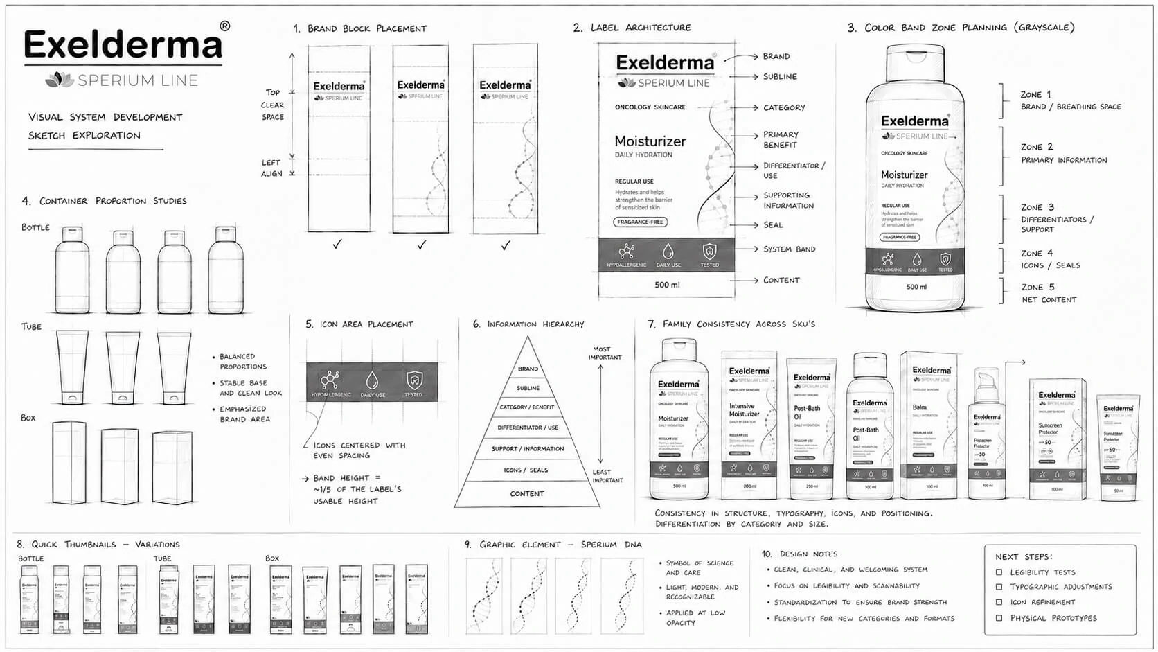
The label was approached as a constrained interface. Brand, purpose, benefit, usage, trust signals and mandatory content each received a defined level in the reading hierarchy.
The architecture begins with the Exelderma brand and Sperium subline, followed by the care category, product name and primary benefit. Usage information and product differentiators occupy the central content zone, while icons, seals and net content are consolidated within a stable lower band.
This sequence supports fast recognition and comparison across shelves or digital product listings. It also reduces redesign effort because each new SKU can inherit the same layout logic instead of requiring a new composition from the beginning.
A fixed upper zone preserves recognition and provides clear separation from product-specific information.
Product name, category and key benefit form the dominant reading layer for quick scanning.
Directions, differentiators, icons, seals and net content are organised into predictable secondary zones.
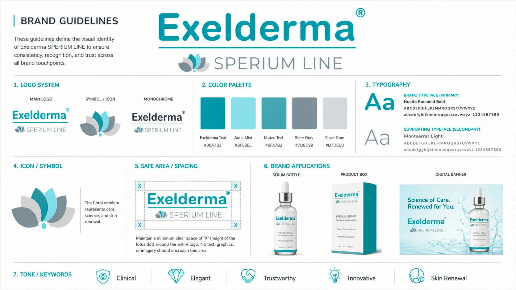
White acts as the principal field across the line, communicating cleanliness, transparency and dermatological care. Soft teal, green, orange, pink and yellow accents are assigned by category, providing orientation without turning the range into a visually fragmented collection.
Organic line motifs suggest skin renewal, balance and regeneration. Their fluidity contrasts with the precision of the typography and modular label structure, adding a more human and reassuring dimension to the identity.
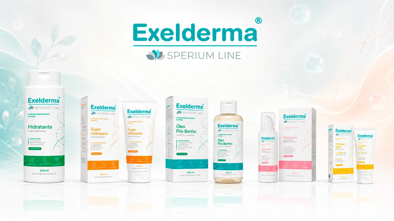
The conceptual family includes products for daily hydration, intensive hydration, post-shower comfort, localised intensive care and sun protection. Each category receives its own colour accent and format-specific adaptation, but all products retain the same alignment, typography, icon logic and information priority.
A large-format bottle designed for frequent hydration and straightforward daily use.
A tube-and-carton system for very dry skin, using a warm category accent.
A bottle-and-carton solution focused on comfort, softness and post-bathing care.
A compact pump format for focused care of fragile areas, nails and cuticles.
A portable tube-and-carton format using a high-visibility yellow category code.
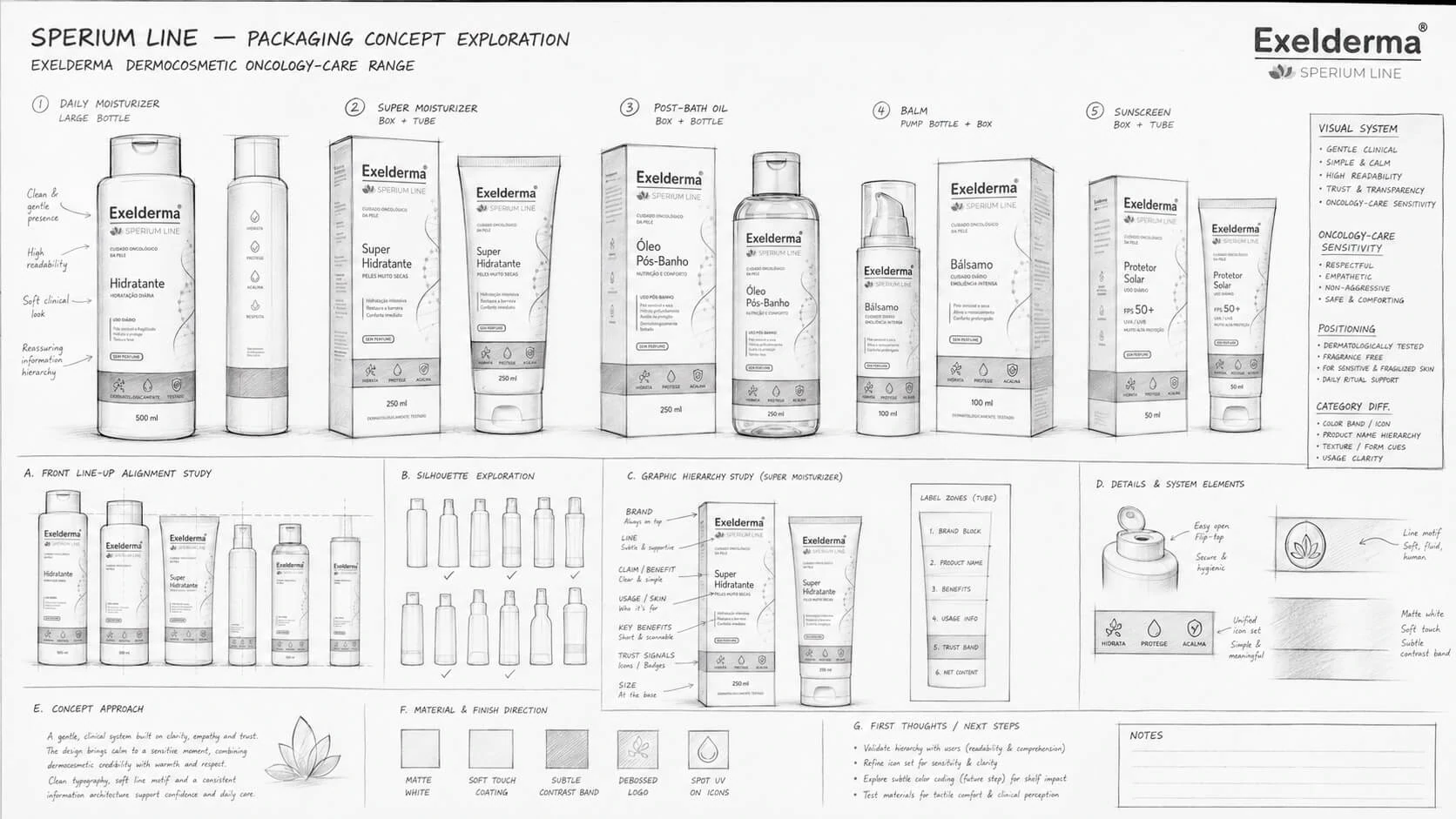
Although the range is conceptual, the system was designed with practical packaging constraints in mind. Text legibility, container curvature, available print area, mandatory information, icon consistency and net-content placement were considered across bottles, tubes, pumps and cartons.
The underlying rules provide a stable foundation for future refinement with regulatory, clinical and production teams. They also make it possible to test physical prototypes and optimise typography or material finishes without changing the core brand architecture.
The hierarchy survives across narrow tubes, wide bottles, pump dispensers and secondary cartons.
Supporting panels and label zones preserve room for ingredients, instructions, warnings and mandatory content.
Shared brand placement and category bands create a coherent shelf presence and faster product comparison.
New products can inherit the same grid, icon logic and category-differentiation model.
The images in this case represent a conceptual product family rather than a range currently available on the market. Product formulations, claims, regulatory requirements, packaging materials and final production specifications remain subject to research, testing and approval.
Presenting the system at high fidelity allows stakeholders to evaluate the brand direction, compare formats, test information hierarchy and identify future refinements before committing to physical production.
The case documents design intent and system thinking. It does not imply that the products have completed clinical, regulatory or commercial validation.
The gallery connects the proposed brand guideline, final family presentation and the exploratory boards used to define hierarchy, proportions and category differentiation.
The resulting concept gives Exelderma a structured foundation for a future oncology-care range. The system protects brand recognition across formats, supports category comparison and creates a calmer reading experience for products intended for sensitive skin and delicate routines.
Five categories feel related through consistent structure, typography, alignment and brand placement.
Primary product purpose is immediately visible, while technical and mandatory information remains organised and predictable.
The architecture can accommodate new formats, categories and content requirements without losing recognition.
In sensitive healthcare contexts, clarity and empathy are not separate design goals. A disciplined information system can communicate clinical confidence while colour, spacing and organic detail make the experience feel more considerate.