Exelderma · Product Extension & Digital Experience
Dermaexel Anti-Stretch Marks
A product identity and responsive content platform designed to extend the Dermaexel ecosystem while communicating a technically complex dermocosmetic proposition with clarity, credibility and brand continuity.
DeliverablesMockup · Wireframes · Website · Social Content
InfrastructurecPanel · DNS · HTTPS · FTP · phpMyAdmin
01 · Project overview
Extending an established dermocosmetic brand into a new product, interface and communication system.
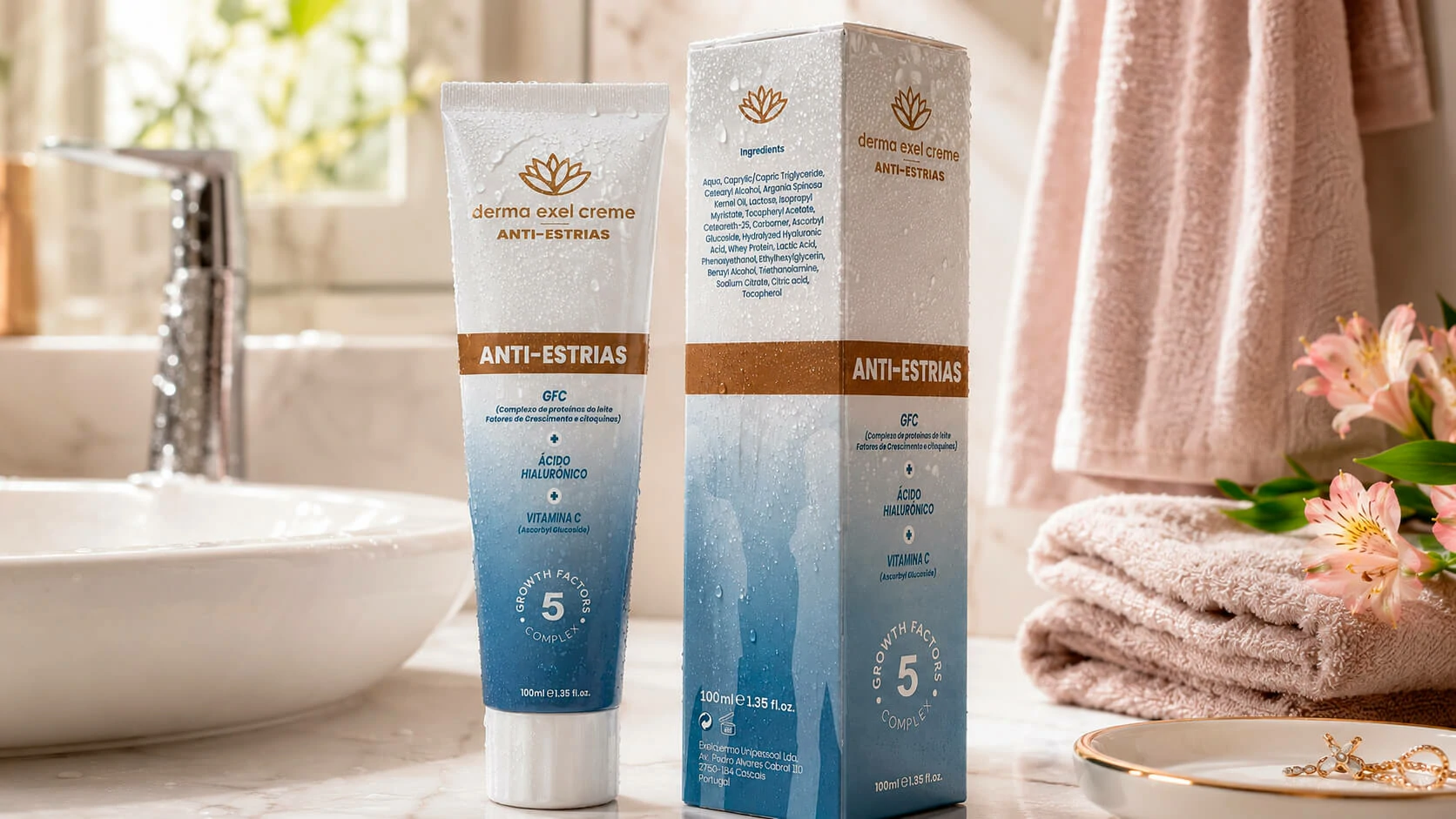
Dermaexel Anti-Stretch Marks was developed for Exelderma as a new product within the company’s dermocosmetic portfolio. The project began with a high-fidelity packaging mockup and evolved into a complete digital experience supporting product education, scientific content, brand credibility and commercial conversion.
The core challenge was to introduce a distinct product proposition without weakening the recognition already built by Dermaexel Skin Repair. The new visual language therefore preserves the parent brand’s clinical authority, restrained presentation and Growth Factors positioning while creating a more specific identity for prevention and stretch-mark care.
The communication hierarchy centres on the product’s three-part formula — Growth Factor Complex, hyaluronic acid and vitamin C — and the five-growth-factor concept presented by the brand. This information had to remain technically credible while still being understandable to non-specialist users.
Project typeProduct extension and digital launch system
Identity continuity, packaging presentation, educational website, social assets and technical deployment were developed as one connected experience.
Primary audienceConsumers researching stretch-mark care
The interface needed to support users with different levels of familiarity, from early prevention research to product evaluation and purchase intent.
Core objectiveTranslate technical credibility into a clear journey
Scientific and product information were organised to build trust without overwhelming the user or disconnecting the website from the wider Dermaexel brand.
02 · Product and experience challenge
A new proposition needed its own identity while remaining visibly part of Dermaexel.
The design problem was not simply to create another product page. Exelderma needed a dedicated content environment capable of explaining causes, prevention, different stretch-mark contexts, supporting studies and product use while guiding interested visitors toward the existing online store.
From a UX perspective, this created three simultaneous requirements: preserve master-brand recognition, structure educational content for progressive discovery and maintain clear conversion pathways. The solution uses a familiar Dermaexel vocabulary but introduces a softer blue-to-white product system, a dedicated content architecture and product-specific visual cues.
Brand continuity
Preserve the Dermaexel signature, clinical tone and Growth Factors credibility across the new product.
Shared logo and naming logic
Recognisable scientific positioning
Consistent typography and hierarchy
Distinct product colour coding
Content architecture
Turn a broad subject into structured pathways that support prevention, education and product evaluation.
Causes and prevention
Stretch-mark classifications and contexts
Studies and supporting content
Contact and online-store routes
Responsive UX
Ensure dense educational material remains readable and usable across desktop, tablet and mobile.
Responsive content modules
Scannable headings and summaries
Flexible image-text compositions
Persistent conversion opportunities
Technical delivery
Prepare the full production environment and connect it to the existing commercial ecosystem.
Hosting and cPanel configuration
WordPress, PHP and MySQL setup
DNS, HTTPS and FTP deployment
Online store and social integration
03 · Workflow
A validation-led process moving from packaging hypothesis to a production-ready platform.
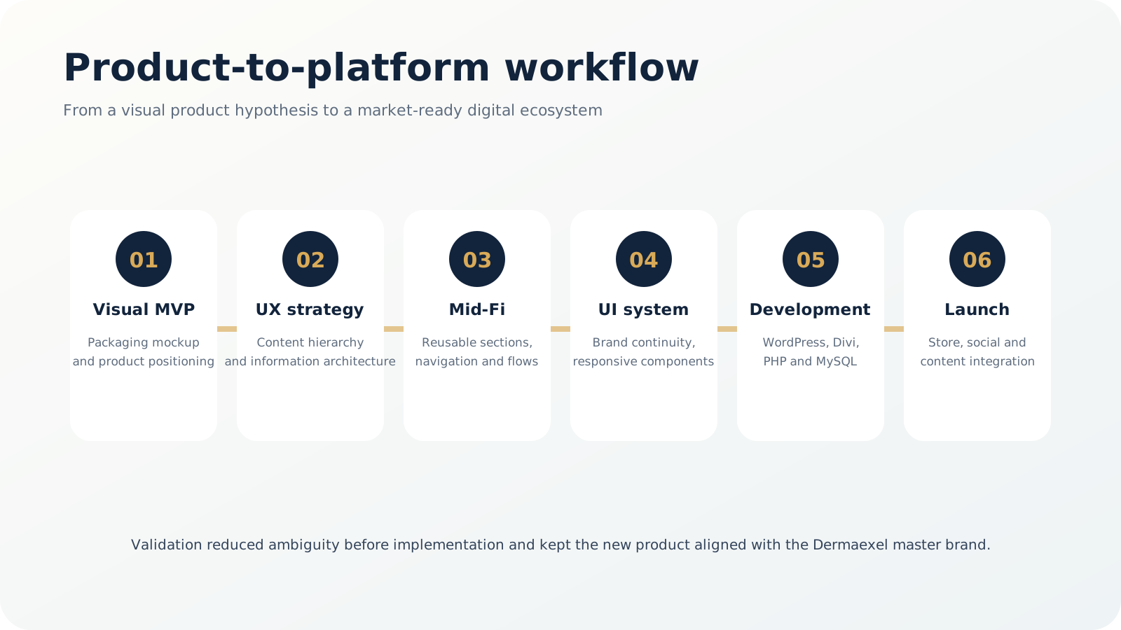
The project used the product mockup as the first alignment artefact. Once the visual direction and relationship with the parent brand were validated, the work progressed into content modelling, information architecture, mid-fidelity wireframes, reusable interface components and implementation.
Why this sequence mattered
Validating the product language before coding reduced rework and created a shared reference for packaging, website sections, social communication and future campaign assets.
04 · UX strategy and information architecture
Scientific content organised through progressive disclosure rather than a single overloaded sales page.
The information architecture separates high-level product understanding from deeper educational content. The homepage introduces the value proposition and key formula components, while dedicated sections expand on causes, prevention, studies, different stretch-mark conditions and contact information.
This structure supports multiple user intents. A visitor can quickly understand the product, explore the subject in more depth, review supporting material, contact the company or continue to the existing online store without being forced through one linear path.
01
Immediate product orientation
The homepage establishes what the product is, how it relates to the Dermaexel brand and which formula elements are central to its positioning.
02
Topic-based discovery
Content is divided into causes, prevention, studies and relevant stretch-mark contexts so users can enter through the question most relevant to them.
03
Evidence-led credibility
Educational and study-related material is visually separated from promotional content, helping the interface retain a serious clinical tone.
04
Connected conversion paths
Calls to action route users toward contact and the pre-existing Dermaexel online store without duplicating the e-commerce implementation.
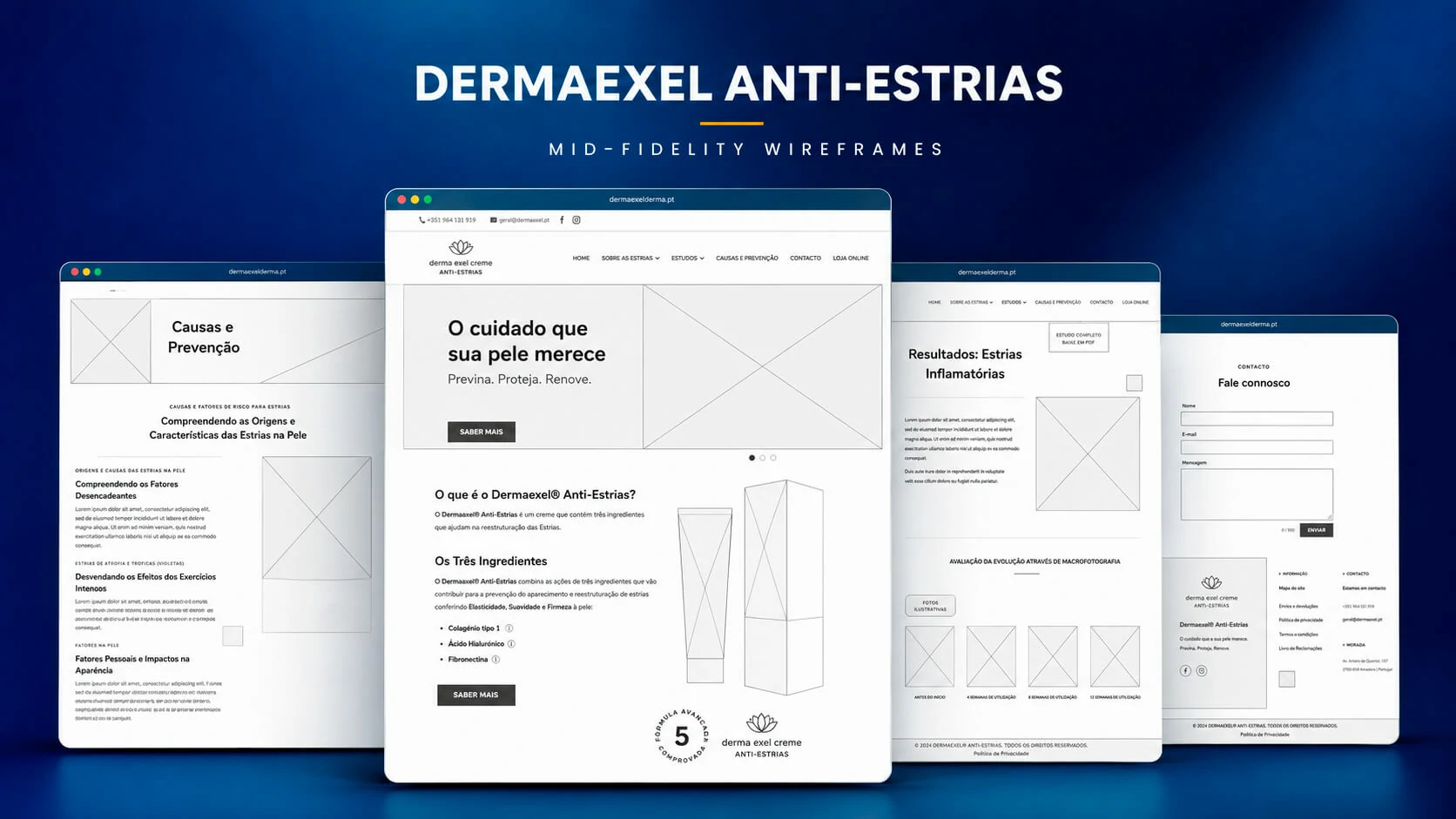
05 · Mid-fidelity wireframes
Defining hierarchy, reusable modules and responsive priorities before visual refinement.
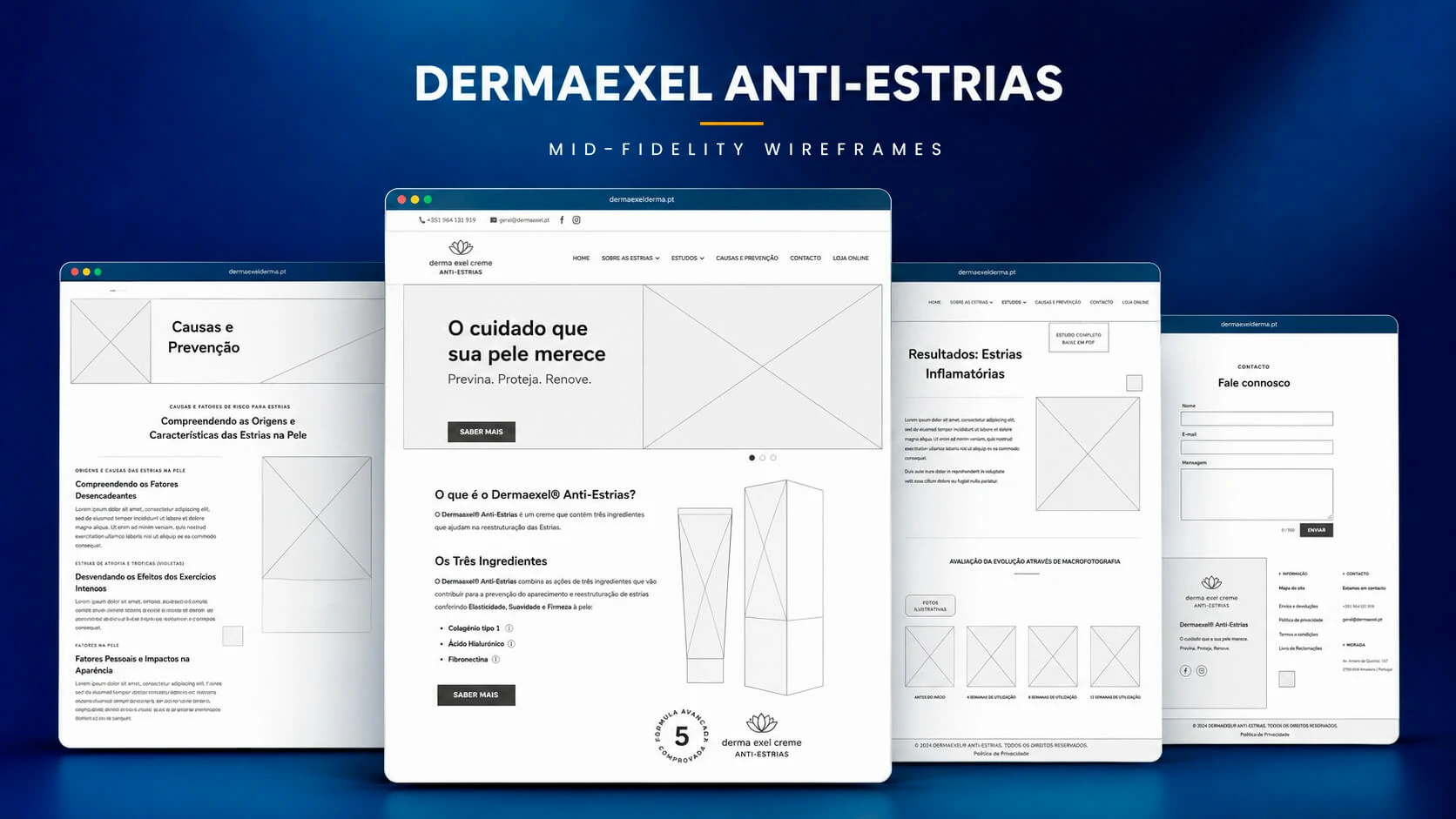
The mid-fidelity stage documented the homepage, educational content, study presentation and contact flow. It focused on layout logic rather than decoration, allowing the team to assess content density, navigation visibility, image placement and component repetition before applying the final brand system.
Wireframes also helped identify which information should remain above the fold, which sections required dedicated pages and how the same modules could collapse on smaller screens without losing context or conversion visibility.
HierarchyProduct first, evidence second, conversion always available
The layout introduces the proposition quickly while allowing deeper content to unfold without obscuring the route to contact or purchase.
ModularityReusable sections and content templates
Consistent structures improve authoring, maintenance and future expansion inside WordPress and Divi.
Responsive planningPriority-based reflow
Content order, image scale and call-to-action placement were considered before the final desktop and mobile implementation.
06 · Product identity and packaging alignment
A distinct anti-stretch-mark system built within the visual boundaries of the parent brand.
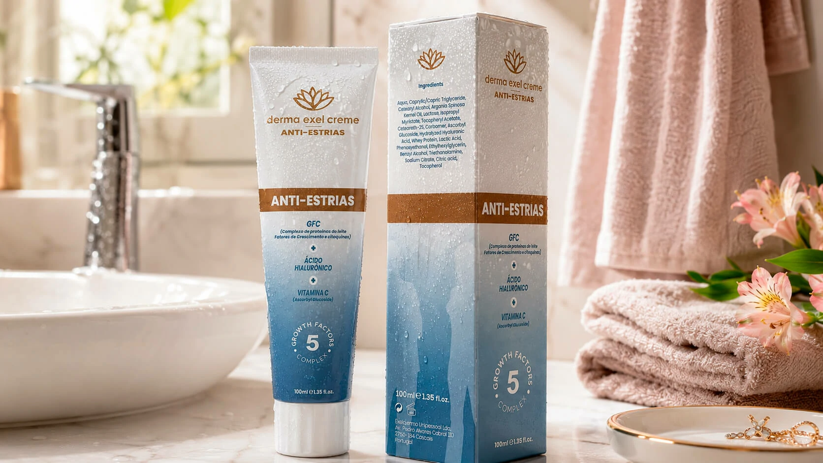
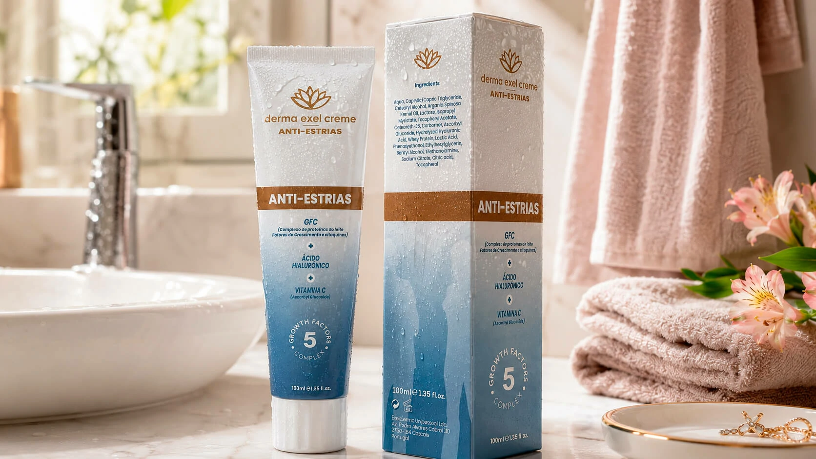
The packaging mockup established the visual anchor for the project. The Dermaexel flower mark, restrained typography and scientific information hierarchy preserve familiarity, while the blue gradient, product descriptor and formula emphasis create clear differentiation from the Skin Repair line.
The website reuses these packaging signals as interface cues. Colour, spacing and iconography reinforce continuity between the physical product, educational pages, social communication and commercial touchpoints.
Brand
Recognisable Dermaexel origin
The identity remains visibly connected to the established Dermaexel system rather than behaving like an unrelated standalone brand.
Product
Clear line differentiation
A dedicated blue gradient and product-specific naming help customers distinguish the Anti-Stretch Marks proposition from other products.
Content
Formula hierarchy on every channel
The Growth Factor Complex, hyaluronic acid and vitamin C remain prominent across packaging, web and campaign materials.
Scale
Reusable visual foundation
The system supports future landing pages, educational content, promotions and partner communication without redesigning the brand each time.
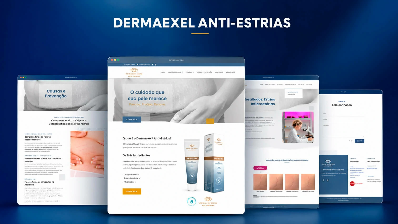
07 · Responsive website and content system
A responsive educational platform designed to build understanding before asking for conversion.
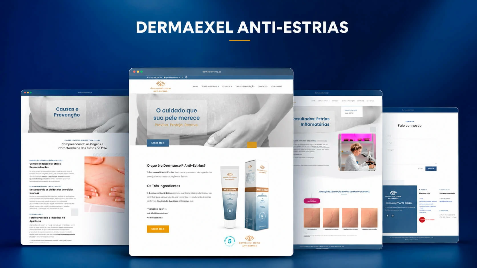
The final website translates the approved product language into a responsive WordPress experience. It combines product presentation, causes and prevention, study-related material, different stretch-mark contexts and contact pathways within a consistent component system.
The interface uses clear section boundaries, generous reading widths and strong heading contrast to make long-form content easier to scan. Desktop compositions preserve breadth, while tablet and mobile layouts reflow text, images and calls to action into a more focused vertical sequence.
Responsive component design
Reusable page sections were configured to adapt across desktop, tablet and mobile without compromising hierarchy.
Flexible grid and column behaviour
Image scaling and cropping rules
Mobile-first reading order
Consistent CTA placement
Content readability
Scientific and educational information was organised into manageable visual units rather than dense uninterrupted pages.
Scannable headings
Controlled line lengths
Supporting visual evidence
Topic-based navigation
Brand consistency
The site carries product colours and packaging signals into the digital experience while remaining part of the Dermaexel family.
Shared brand signature
Product-specific blue palette
Clinical visual restraint
Cross-channel continuity
Conversion architecture
Users can move from education to contact, social channels or the existing store without duplicating the commercial infrastructure.
Online-store routing
Contact form pathways
Social-channel connections
Contextual calls to action
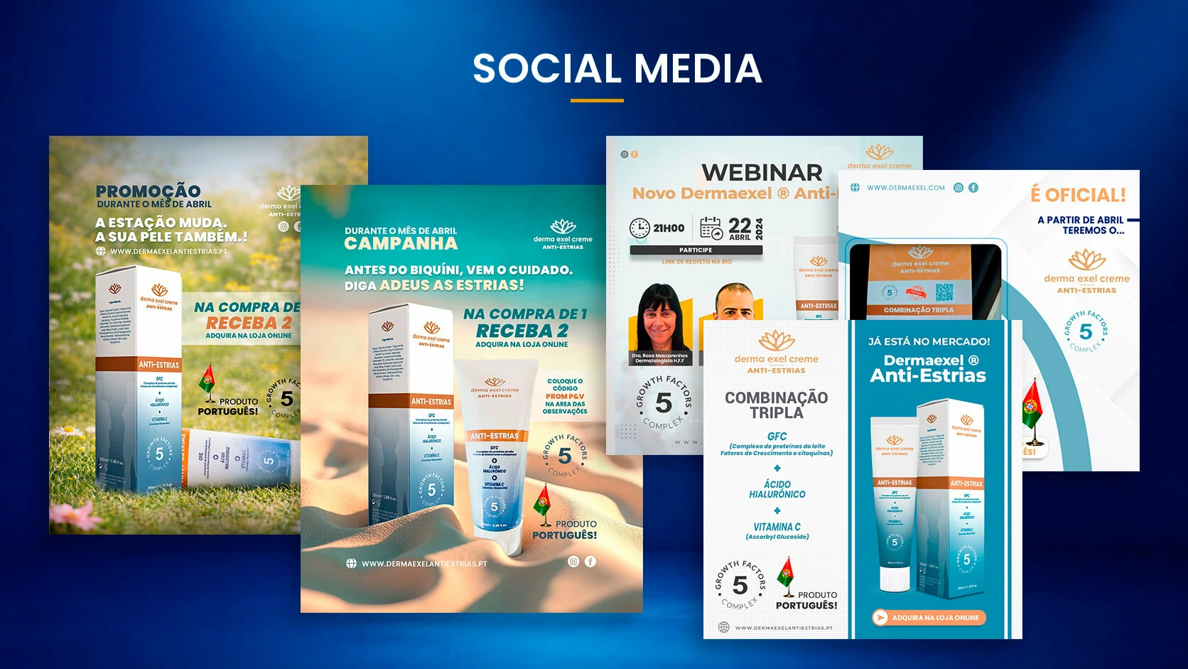
08 · Connected ecosystem and social communication
Website, existing store and campaign content operating as one product ecosystem.
The project did not create an isolated marketing site. The new platform was connected to the existing Dermaexel online store developed during the first project, preserving a single commercial destination while giving the Anti-Stretch Marks product its own educational and campaign environment.
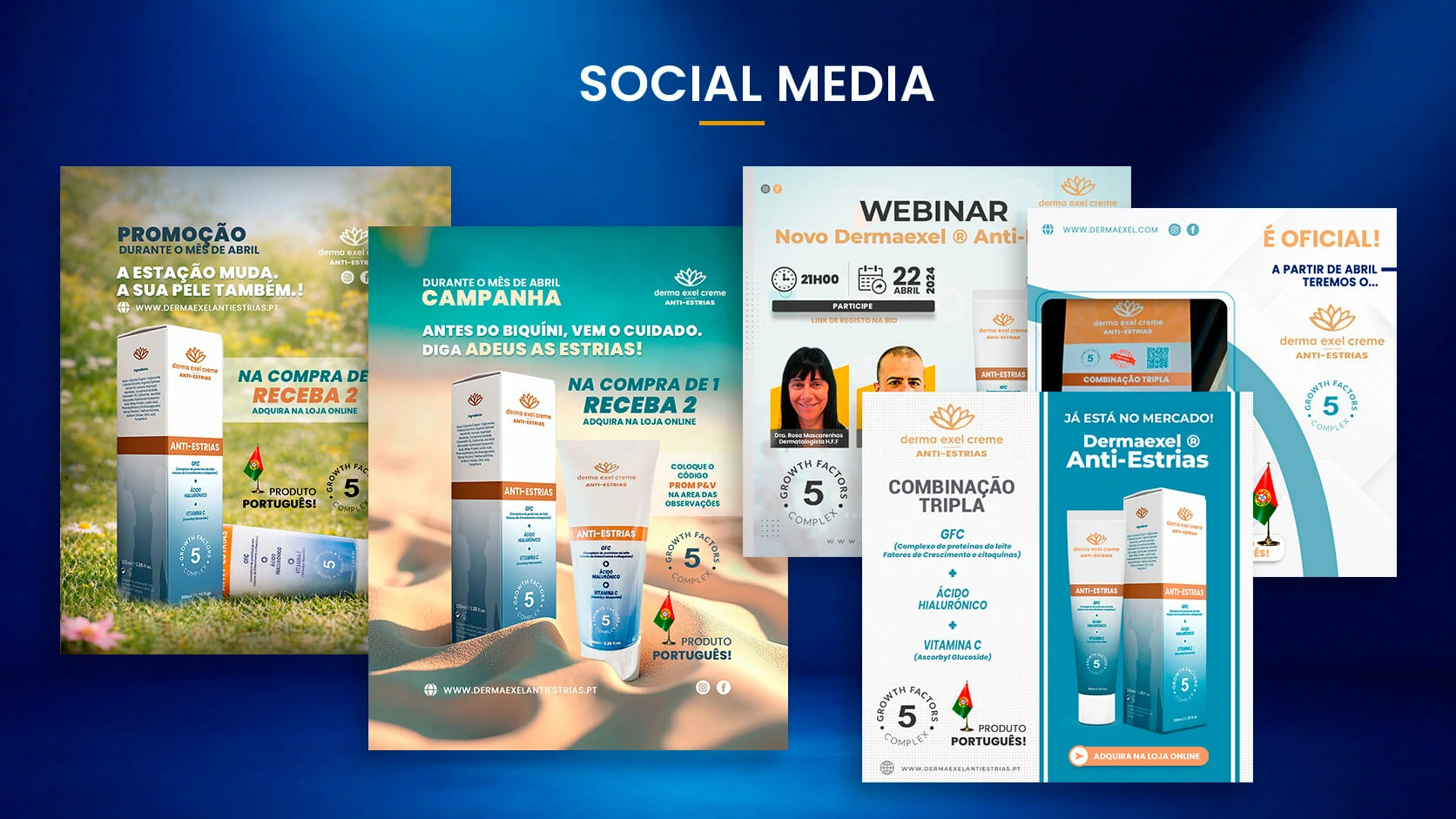
Social communication extends the same visual language into launch announcements, promotional campaigns, webinars and product education. This creates continuity between the user’s first contact with a post, deeper research on the website and the final route to purchase.
CommerceExisting Dermaexel store integration
The content platform supports discovery and education while the established store remains the commercial source of truth.
CampaignsLaunch, promotion and webinar formats
Reusable campaign assets support product awareness, education and time-sensitive commercial communication.
ContinuityOne message across packaging, web and social
Repeated visual and content cues reduce friction as users move between channels.
09 · Technical delivery and infrastructure
A maintainable WordPress environment prepared from hosting configuration to production deployment.
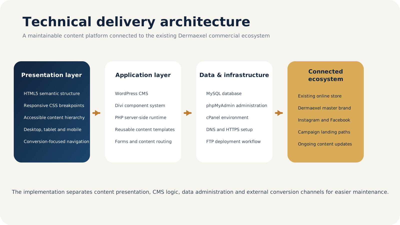
The site was implemented in WordPress using Divi as the visual component framework, supported by semantic HTML5, responsive CSS and PHP within the WordPress runtime. MySQL stores the CMS content and configuration, while phpMyAdmin provides controlled database administration inside the hosting environment.
The production setup included hosting preparation, cPanel configuration, database and user creation, DNS routing, HTTPS activation and FTP-based deployment. The objective was to create an environment that the business could maintain and expand without compromising the consistency established during the UX/UI phase.
WordPress + DiviCMS, reusable components and visual page management
HTML5 + CSSSemantic structure, responsive layouts and interface refinement
PHPServer-side WordPress execution and template logic
MySQLContent, settings and application data storage
phpMyAdminDatabase creation, inspection and administration
cPanelHosting environment, files, databases and operational configuration
DNS + HTTPSDomain routing, certificate activation and secure production access
FTPControlled deployment and production asset management
10 · Full project gallery
Product, planning, final interface, communication and technical documentation.
The gallery brings together the packaging mockup, mid-fidelity wireframes, completed website, social communication and the technical diagrams created to document the project workflow and production architecture.
11 · Outcome and learning
A validated product concept expanded into a coherent, maintainable and market-facing digital ecosystem.
The project moved beyond a standalone mockup and created a consistent relationship between product identity, scientific communication, responsive UX, commercial pathways and social content. The Anti-Stretch Marks product is now presented as a clear extension of Dermaexel rather than a disconnected launch.
Brand continuity with product differentiation
The visual system retains Dermaexel recognition while giving the new product a distinctive colour, hierarchy and communication focus.
A structured educational experience
Users can move from introductory product information into causes, prevention, studies and relevant stretch-mark contexts without navigating one overloaded page.
A maintainable technical foundation
WordPress, Divi, PHP, MySQL and the configured hosting environment support ongoing content, campaigns and future product evolution.
Key learning
For product extensions, visual consistency alone is not enough. The strongest continuity came from aligning packaging cues, information hierarchy, content tone, conversion logic and technical maintainability across every touchpoint.