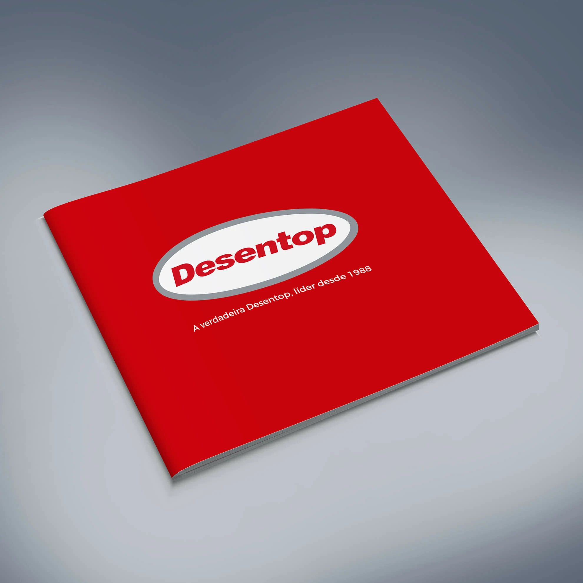
An institutional brochure designed as a structured commercial interface, translating more than three decades of sanitation expertise into a clear, credible and visually consistent brand presentation.
RoleArt Direction · Editorial Design · Information Design
CategoryProfessional Services · Institutional Communication
DeliverablesBrochure System · Layout · Typography · Mockups
ContextLisbon · Portugal
01 · Project overview
An institutional publication designed to make technical capability easier to understand, present and sell.
Desentop is a Lisbon-based company within the Spanish Assista Group, specialising in sanitation and drainage services for residential, commercial, institutional and industrial clients. With more than 30 years of experience, the company required a brochure capable of representing both the breadth of its services and the maturity of its operation.
The project was approached as more than a conventional company catalogue. The brochure became a structured communication system: a linear experience that introduces the organisation, establishes credibility, explains technical services, presents areas of operation and supports commercial conversations with different types of decision-makers.
Editorial design principles were applied with the same discipline used in digital product interfaces. Content was grouped by purpose, hierarchy was made explicit, and every spread was designed to help readers scan, understand and retain complex information without losing the brand’s strong visual presence.
Business contextMore than 30 years of sanitation expertise
The brochure needed to communicate operational experience across domestic, corporate, institutional and industrial environments.
Design objectiveConvert technical depth into accessible communication
Dense service information was organised into a readable editorial journey with clear priorities and controlled visual density.
Commercial functionSupport presentations and business development
The final piece was designed to work as both an institutional introduction and a practical sales-enablement tool.
02 · Communication challenge
One publication had to communicate scale, technical reliability and a highly diverse service portfolio.
Desentop operates across multiple levels of complexity, from domestic drainage interventions to technical solutions for hotels, restaurants, industrial facilities, institutions and national or international companies. Presenting this breadth without creating an overloaded catalogue required a strong information-design strategy.
The communication challenge was therefore twofold: preserve enough detail to demonstrate real expertise while giving non-technical readers a fast understanding of the company’s value, operational scope and credibility.
01
Multiple audiences
The content needed to remain useful for homeowners, facility managers, procurement teams, hospitality businesses and industrial decision-makers.
02
High information density
Technical descriptions, business context, service categories, geographic coverage and client references had to coexist without competing for attention.
03
Institutional credibility
The visual language needed to feel established and technically competent rather than promotional or visually excessive.
04
Commercial usability
Each spread had to support a conversation, allowing a representative to locate relevant proof points and service information quickly.
03 · Editorial architecture
A modular grid created consistency while allowing each spread to respond to a different level of content complexity.
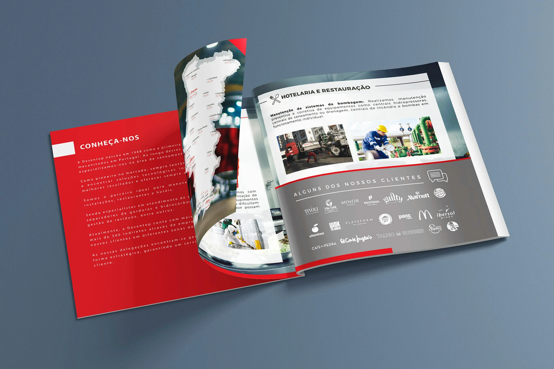
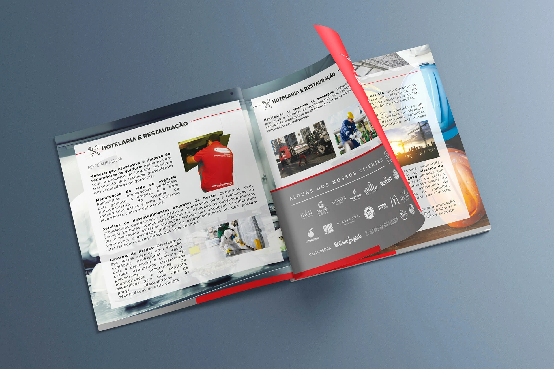
The brochure was structured through a modular editorial grid that controlled columns, image zones, text blocks, colour fields and recurring institutional elements. This system made it possible to alternate between introductory pages, service-heavy spreads, geographic information and client validation without breaking visual continuity.
From a UX perspective, the page sequence functions as a guided journey. Early spreads introduce the company and establish context; subsequent pages move into capabilities and service categories; supporting content then reinforces reach, experience and client trust. This progressive disclosure prevents the reader from receiving every detail at once.
Editorial UX principle
The brochure was treated as a navigable information product. Repetition creates orientation, controlled variation sustains attention, and each spread has a clear primary reading path.
04 · Art direction
Brand red provides recognition and energy, while neutral tones create structure, contrast and institutional maturity.
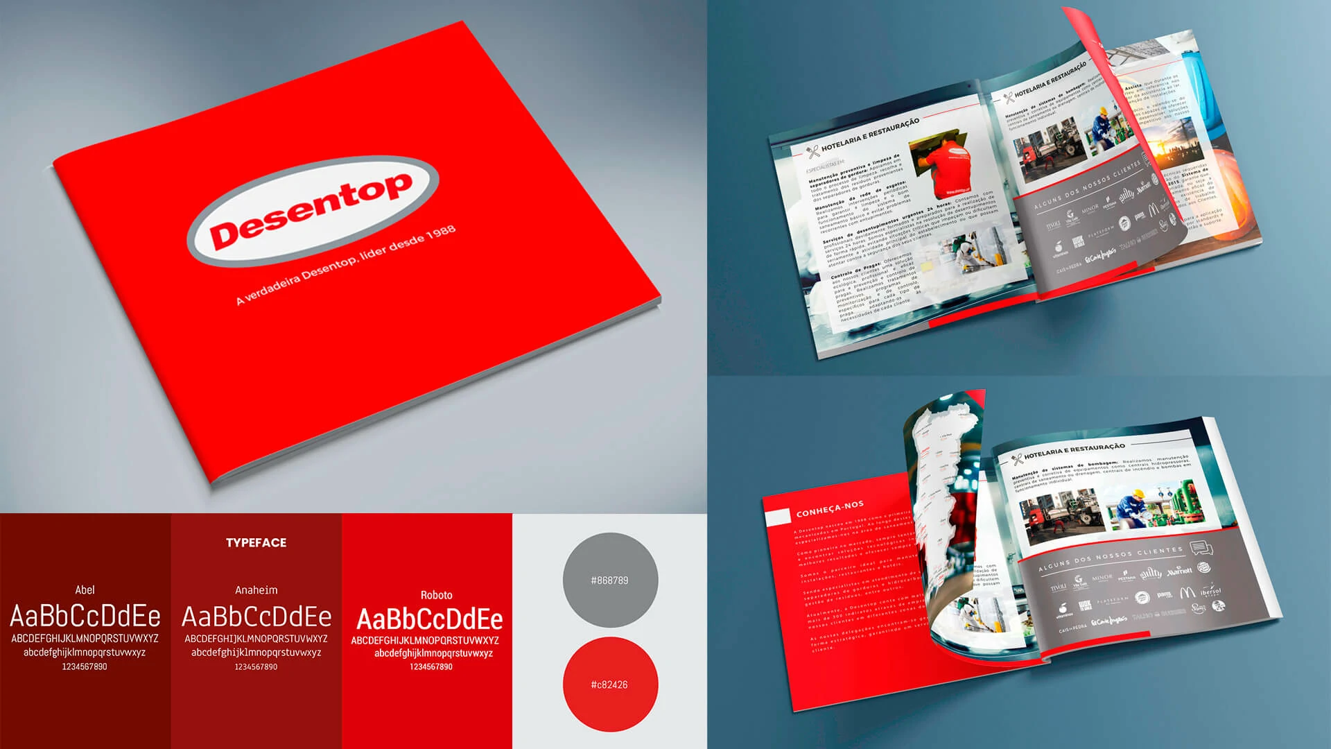
The art direction begins with Desentop’s red as the main recognition device. Rather than using it uniformly, the colour is assigned specific roles: section opening, directional emphasis, important statements, visual framing and selected background areas.
Grey, white and darker neutral tones reduce visual fatigue and provide a more sophisticated base for technical content. Images are placed in dynamic frames and layered compositions to introduce movement, while generous negative space allows dense information to remain approachable.
05 · Typography and hierarchy
A multi-level typographic system makes technical material scannable without reducing its professional depth.
Different type families, weights and scales were combined to establish clear distinctions between section titles, service headings, explanatory copy, captions, client references and highlighted statements. The system was designed to preserve hierarchy even on spreads containing several content types.
Shorter line lengths, visible spacing between information groups and consistent alignment improve reading speed. Strong headings guide scanning, while body text remains neutral and functional. This combination helps specialist content feel organised rather than intimidating.
Primary hierarchy
Large section headings and restrained graphic markers establish the purpose of each spread immediately.
Secondary hierarchy
Service names, subheadings and highlighted statements separate related topics into manageable reading units.
Supporting information
Body copy, captions and client references use consistent spacing and alignment to maintain readability at smaller sizes.
06 · Commercial communication
The brochure works as a business-development tool, not only as an institutional record.
The final publication communicates who Desentop is, what it can deliver, where it operates and why its experience is relevant. Services are framed around operational needs, while client references and sector-specific applications provide immediate social proof.
This balance allows the brochure to support several contexts: introductory meetings, proposals, supplier qualification, corporate presentations and sector-specific conversations. The design gives the sales team a consistent narrative while still allowing individual pages to be used independently.
07 · Full project gallery
From brand cover to structured service communication.
The gallery presents the complete visual progression: cover recognition, editorial system, institutional narrative and detailed service spreads.
08 · Outcome and learning
A mature editorial system that communicates technical competence with clarity and commercial purpose.
The completed brochure gives Desentop a structured way to present more than three decades of experience without reducing the complexity of its services. Its visual system reinforces brand recognition, while its information architecture helps different audiences understand the company’s scope quickly.
Clearer technical communication
Service information is divided into meaningful groups and supported by explicit headings, images and controlled visual density.
Stronger institutional perception
The consistent editorial system conveys organisation, operational maturity and confidence across every spread.
A practical sales asset
The publication supports presentations, proposals and qualification conversations while keeping the company narrative consistent.
Design learning
For complex B2B communication, visual sophistication comes from structure rather than decoration. A reliable grid, explicit hierarchy and disciplined spacing can make highly technical content feel both authoritative and accessible.